Xceed SmartUI lets you create the very latest style, which appeared with Office 2000.
First Example
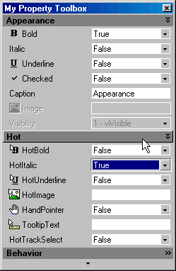
The first example shows a SmartUI containing GroupToolBox, ComboFlat, and EditFlat SmartItems.

This SmartUI:
- displays a Raised Border style (BorderStyle=bsRaised),
- has no Caption, and its Caption style is set to none (CaptionStyle=csNone)
- is vertical (Orientation=orVertical),
- is opaque (BackStyle=bkOpaque), but it may have been transparent or semi-transparent
- has its Sorted Property set to false (Sorted=False): the SmartItems are not sorted alphabetically
- has its ShowFocusRect Property set to false (ShowFocusRect =False): no focus rect with dotted lines
- displays a PagerAuto ScrollBar style (ScrollBarStyle=sbPagerAuto),
- shows no PlusMinus style (PlusMinusStyle=pmNone) and no Treelines (ShowTreeLines=False).
Now let's have a more detailed look at the SmartItems.
This SmartUI contains following SmartItems:
- 3 GroupToolBox ("Appearance", "Hot", "Behavior"), which all have their Visible property set to Visible Only In ExtendMode (Visibility=viOnlyInExtendMode)
- 9 ComboFlat SmartItems ("Bold", "Italic", "Underline", "Checked", "HotBold", "HotItalic", "HotUnderline", "HandPointer", "HotTrackSelect"). One of them ("Visibility") has its Enabled property set to false (Enabled=False). Most of them have Caption and Image
- 4 EditFlat SmartItems ("Caption", "HotImage", "TooltipText"). Most of them have Caption and Image. One of them ("Image") has its Enabled property set to false (Enabled=False).
"Hot" and "Appearance" have their Expanded property set to true (Expanded=True), whereas "Behavior" has its Expanded property set to False (Expanded=False).
All Items, except the GroupToolBox SmartItems (headers) have their Indent set to 1 (Indent=1).
Second Example
In the second example, we needed a specific input and thus have integrated an external object.
This external Object (example VB MaskEdit control) is automatically moved or hidden, as needed, and is automatically integrated in the SmartUI, behaving exactly like a SmartItem. This means that he gets the Focus, when needed.
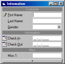
This example shows a SmartUI containing MenuSeparatorBar, EditFlat, ComboFlat, and MiscObjectFlat SmartItems.
This SmartUI:
- displays a Raised Border style (BorderStyle=bsRaised),
- has no Caption, and its Caption style is set to none (CaptionStyle=csNone)
- is vertical (Orientation=orVertical),
- is opaque (BackStyle=bkOpaque), but it may have been transparent or semi-transparent
- has its Sorted Property set to false (Sorted=False): the SmartItems are not sorted alphabetically
- displays a PagerAuto ScrollBar style (ScrollBarStyle=sbPagerAuto),
- shows no PlusMinus style (PlusMinusStyle=pmNone) and no Treelines (ShowTreeLines=False).
Now let's have a more detailed look at the SmartItems.
This SmartUI contains:
- 3 MenuSeparatorBar with the Caption aligned to the center ("Customer", "Information", and "Misc")
- 3 EditFlat SmartItems ("First Name", "Last Name", "Misc 1"), with Caption, and Image, when the item gets the focus (the pen).
- 1 ComboFlat ("Gender"), which also has an image (pen) when it gets the focus.
- 2 MiscObjectFlat ("Check-In", "Check-Out")
Remarks
As you now can imagine, we could also have implemented 3D SmartObjects.Of course, you can customize each item with Bold, HotBold, Underline, HotUnderline, Italic, HotItalic, ForeColor, HotForeColor, Image, HotImage, and so on. Besides, as all those SmartItems can have the Focus, you can specify SelectedBold, SelectedUnderline, SelectedItalic, SelectedImage, and even HotTrackSelect Properties.
And as incredible as it may seem, this SmartUI remains a windowless control!
See Also
ListBoxes, MenuBars, ToolBars, StatusBars, OutlookBars or ViewBars, TreeViews, OptionLists, PropertyLists, TabstripsFor more information on Property Toolboxes, you can see the Lesson 12 and Lesson 14.