Xceed SmartUI lets you mimic OutlookBars or ViewBars. Like every SmartUI, you can of course create objects, which are horizontally orientated (Orientation=orHorizontal).
First Example
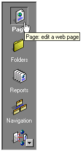
The first example shows a SmartUI containing ViewBarButtonGroup SmartItems. These SmartItems have the SelectedBold (SelectedBold=True) and HandPointer (HandPointer=True) Properties set to true.
This SmartUI:
- displays a Sunken Border style (BorderStyle=bsSunken),
- has no Caption, and its Caption style is set to none (CaptionStyle=csNone)
- is vertical (Orientation=orVertical),
- is opaque (BackStyle=bkOpaque), but it may have been transparent or semi-transparent,
- has its Sorted Property set to false (Sorted=False): the SmartItems are not sorted alphabetically
- displays a normal ScrollBar style (ScrollBarStyle=sbNormal),
Now a few more details on the SmartItems: this SmartUI contains ViewBarButtonGroup SmartItems with Caption and Image, and ToolTipText, as shown in "Page".
Within the same group, only one ViewBarButtonGroup can be checked. In this case, "Page" is checked (Checked=True).
See Lesson 4 for more information.
Second Example
The second example is rather similar, but the SmartUI is horizontal (Orientation=orHorizontal), and displays a Pager3D ScrollBar style (ScrollBarStyle=sbPager3D).

See Lesson 4 for more information.
Third Example
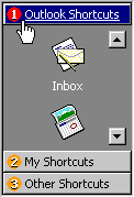
The third example shows a SmartUI containing GroupHeaderObject SmartItems ("Outlook Shortcuts", "My Shortcuts", "Other Shortcuts"). Each GroupHeaderObject Value is set to an object name. This object can be a SmartUI or any other object from the same parent (in this case, the objects are SmartUI objects).
This SmartUI:
- displays a Sunken BorderStyle (BorderStyle=bsSunken)
- has no Caption
- is vertical (Orientation=orVertical)
- is opaque (BackStyle=bsOpaque)
- displays no ScrollBarStyle (ScrollBarStyle=sbNone)
Now let's have a more detailed look at the SmartItems.
- The first GroupHeaderObject has its Caption set to "Outlook Shortcut", and is aligned to the left (Alignment=alLeftJustify).
"Outlook Shortcuts" has a Image (an orange "1" bullet) and a HotImage (the red "1" bullet seen here).
Its Hot Appearance is set to Underline ( HotUnderline=True). It displays a white HotForeColor and a blue HotBackColor. And the HandPointer (HandPointer=True) Property is set to true.
The HotTrackSelect is set to true: leaving the mouse a few second on the SmartItem automatically generates the Click event. No need to click on the SmartItem to select it!
The "Outlook Shortcut" GroupHeaderObject contains a SmartUI, which has the following properties:
- displays no Border (BorderStyle=bsNone)
- has no Caption
- is vertical (Orientation=orVertical)
- is opaque (BackStyle=bsOpaque), but may have been transparent or semi-transparent
- displays a Button3DOnly ScrollBarStyle ( ScrollBarStyle=sbButton3DOnly).
This SmartUI contains ViewBarDefault SmartItems, with Image, and a ForeColor set to "Highlight Text", and which are aligned to the center (Alignment=alCenter).
See Lesson 20 for more information.
Fourth Example
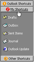
The fourth example is rather similar. It shows a SmartUI with the same properties than in the 3rd example, described above, namely a SmartUI containing GroupHeaderObject SmartItems ("Outlook Shortcuts", "My Shortcuts", "Other Shortcuts"). Each GroupHeaderObject Value is also set to an object name. This object can be a SmartUI or any other object from the same parent (in this case, the objects are SmartUI objects).

For the SmartUI properties, please see above.
Now let's have a more detailed look at the SmartItems.
- The GroupHeaderObject SmartItems displayed here are aligned to the center (Alignment=alCenter).
"My Shortcuts" has a Image (an orange "1" bullet) and a HotImage (the red "1" bullet seen here), as in the 3rd example.
Its Hot Appearance is set to Underline ( HotUnderline=True). But contrary to the 3rd example, it displays no special HotForeColor and no special HotBackColor. The HandPointer (HandPointer=True) Property is set to true.
And the HotTrackSelect is set to true: leaving the mouse a few second on the SmartItem automatically generates the Click event. No need to click on the SmartItem to select it!
The "My Shortcuts" GroupHeaderObject contains a SmartUI, which has the following properties:
- displays no Border (BorderStyle=bsNone)
- has no Caption
- is vertical (Orientation=orVertical)
- is opaque (BackStyle=bsOpaque), but may have been transparent or semi-transparent
- displays no ScrollBarStyle ( ScrollBarStyle=sbNone).
This SmartUI contains ViewBarSmallDefault SmartItems, with Image, and a ForeColor set to "Highlight Text", and which are aligned to the left (Alignment=alLeftJustify). As you can see here, the Caption of ViewBarSmallDefault SmartItems is displayed on the right side of the object.
See Lesson 20 for more information
Fifth Example
The fifth example shows a SmartUI containing GroupHeaderObject SmartItems ("First", "Second", "Third"). As above, each GroupHeaderObject Value is set to an object name. This object can be a SmartUI or any other object from the same parent (in this case, the objects are SmartUI objects).

This SmartUI:
- displays a Sunken BorderStyle (BorderStyle=bsSunken)
- has no Caption
- is horizontal (Orientation=orHorizontal)
- is opaque (BackStyle=bsOpaque)
- displays no ScrollBarStyle (ScrollBarStyle=sbNone)
Now let's have a more detailed look at the SmartItems.
Here is a good example of the different Alignment possibilities. The 1st GroupHeaderObject has its Caption set to "First", and is aligned to the left (Alignment=alLeftJustify). The 2nd GroupHeaderObject has its Caption set to "Second", and is aligned to the center (Alignment=alCenter). The 3rd GroupHeaderObject has its Caption set to "Third", and is aligned to the right (Alignment=alRightJustify).
The 3 GroupHeaderObject SmartItems have a Image (an orange "1" bullet) and a HotImage (the red "1" bullet seen here).
The HandPointer (HandPointer=True) Property is set to true.
The "Second" GroupHeaderObject contains a custom made object similar to the Outlook Notes object.
See Lesson 20 for more information.
Remarks
We may have added other SmartItems type like ViewBarCheck, ViewBarSmallCheck, ViewBarButtonGroup or ViewBarSmallButtonGroup.Of course, you can customize each item with Bold, HotBold, Underline, HotUnderline, Italic, HotItalic, ForeColor, HotForeColor, Image, HotImage, Alignment, BackColor, HotBackColor, SelectedBackColor, SelectedForeColor, HandPointer and so on.
See Also
ListBoxes, MenuBars, ToolBars, StatusBars, TreeViews, OptionLists, PropertyLists, PropertyToolBoxes, TabstripsFor more information on ViewBars, you can see the Lesson 4 and 20.