Xceed SmartUI lets you create TreeViews with all kind of SmartItems you need. Treelines can be visible or not; PlusMinus Buttons can be flat, 3D, or simply hidden.
First Example
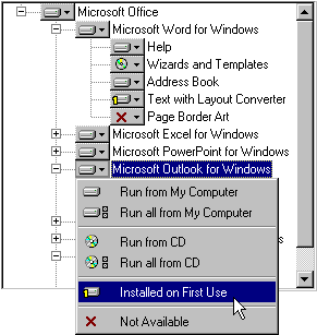
This example shows a SmartUI containing ListItemDefault SmartItems.
This SmartUI:
- displays a Sunken Border style (BorderStyle=bsSunken),
- has no Caption, and its Caption style is set to none (CaptionStyle=csNone)
- is vertical (Orientation=orVertical),
- is opaque (BackStyle=bkOpaque), but it may have been transparent or semi-transparent
- has its Sorted Property set to false (Sorted=False): the SmartItems are not sorted alphabetically
- has its ShowFocusRect Property set to true (ShowFocusRect =True): the focus rect appears with dotted lines), as shown on "Microsoft Outlook for Windows"
- displays a Normal ScrollBar style (ScrollBarStyle=sbNormal)
- shows ButtonFlat PlusMinus Buttons (PlusMinusStyle=pmButtonFlat) , and Treelines (ShowTreeLines=True).
Now let's have a more detailed look at the SmartItems.
This SmartUI contains ListItemDefault SmartItems with Image, Caption and different Indent:
A SmartUI Menu is simply Popup (with MenuFullRow SmartItems), when the Image is clicked.
For more information on this kind of MenuTool, you can see the MenuBars example, the Lesson 8 or the Lesson 9. And for more information on this TreeView, see Lesson 10.
Second Example
This example shows a SmartUI containing ListItemDefault SmartItems.

This SmartUI:
- displays an Etched Border style (BorderStyle=bsEtched),
- has a Caption ("Drive c:\") which is aligned to the left (CaptionAlignment=alLeftJustify), and a Flat Caption style (CaptionStyle=csFlat)
- is vertical (Orientation=orVertical),
- is transparent (BackStyle=bkTransparent),
- has its Sorted Property set to false (Sorted=False): the SmartItems are not sorted alphabetically
- has its ShowFocusRect Property set to true (ShowFocusRect =True): the focus rect appears with dotted lines),
- displays a Normal ScrollBar style (ScrollBarStyle=sbNormal)
- shows ButtonFlat PlusMinus Buttons (PlusMinusStyle=pmButtonFlat) , and Treelines (ShowTreeLines=True).
Now let's have a more detailed look at the SmartItems.
This SmartUI contains ListItemDefault SmartItems with Image, Caption and different Indent:
You can decide to sort only a group of SmartItems, for example only the children of a Node, thanks to the Sort Method. With this method, you specify the first and the last SmartItem you want to be sorted.
Note: This screenshot also shows a StatusBar SmartUI, with PanelText and PanelDescription SmartItems.
Remarks
Of course, you can customize each item with Bold, HotBold, Underline, HotUnderline, Italic, HotItalic, ForeColor, HotForeColor, Image, HotImage, and so on. Besides, as all those SmartItems can have the Focus, you can specify SelectedBold, SelectedUnderline, SelectedItalic, SelectedImage, and even HotTrackSelect Properties.
See Also
ListBoxes, MenuBars, ToolBars, StatusBars, OutlookBars or ViewBars, OptionLists, PropertyLists, PropertyToolBoxes, Tabstrips
For more information on TreeViews, you can see the Lesson 10.