A similar but more flexible version of MAUI Framework's
RadioButton control since, for example, it can easily be resized, can have its own
ContentView & offers 3 different states (
Checked,
Unchecked &
Indeterminate). On top of that, clicking on either the box or the
Control's
Content can trigger an animation & multiple
RadioButtons can be grouped together for organization & selection purposes.
The following code would display this control:
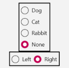
<xctk:Border BorderBrush="Black"
             BorderThickness="2"
             HorizontalOptions="Center">
  <VerticalStackLayout>
    <xctk:RadioButton Content="Dog"
                      GroupName="Animal"/>
    <xctk:RadioButton Content="Cat"
                      GroupName="Animal"/>
    <xctk:RadioButton Content="Rabbit"
                      GroupName="Animal"/>
    <xctk:RadioButton Content="None"
                      GroupName="Animal"
                      IsChecked="True"/>
  </VerticalStackLayout>
</xctk:Border>
<xctk:Border BorderBrush="Black"
             BorderThickness="2"
             HorizontalOptions="Center">
  <HorizontalStackLayout>
    <xctk:RadioButton Content="Left"
                      GroupName="Hand"/>
    <xctk:RadioButton Content="Right"
                      GroupName="Hand"
                      IsChecked="True"/>
  </HorizontalStackLayout>
</xctk:Border>
Target Platforms: Windows 11, Windows 10, Windows 7, Windows Vista SP1 or later, Windows XP SP3, Windows Server 2008 (Server Core not supported), Windows Server 2008 R2 (Server Core supported with SP1 or later), Windows Server 2003 SP2