A more flexible Button control than the one offered by the MAUI Framework, since it can use all of the advantages offered by the
Border control (independent
BorderThickness &
CornerRadius, alignment, property inheritance, ...) and can contain any type of
View &
ContentTemplate. It also offers a
ClickMode that allows to activate it on a
Press or
Release action of the pointer.
The following code will display this Button:
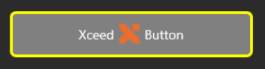
<xctk:Button Background="Gray"
             BorderBrush="Yellow"
             BorderThickness="3"
             CornerRadius="5"
             Margin="20">
 <HorizontalStackLayout>
  <Label Text="Xceed"
         VerticalOptions="Center"/>
  <Image HeightRequest="32"
         WidthRequest="32"
         Source="Resources/Images/logox.png"/>
  <Label Text="Button"
         VerticalOptions="Center"/>
</HorizontalStackLayout>
Target Platforms: Windows 11, Windows 10, Windows 7, Windows Vista SP1 or later, Windows XP SP3, Windows Server 2008 (Server Core not supported), Windows Server 2008 R2 (Server Core supported with SP1 or later), Windows Server 2003 SP2