Xceed DataGrid for WPF v7.3 Documentation
Views and Themes Overview
Xceed DataGrid for WPF supports various views, which determine the general layout of the data items in a grid. These views are represented by the CardView, CompactCardView, TableView, and TableflowView classes, which derive from the UIViewBase class, as well as the CardflowView3D class, which derives from the MultiSurfaceViewBase class.
The TableView and TableflowView classes lay out data items as typical rows, while the CardView and CompactCardView classes lay out data items as cards. Either card-view layout can be used to display data items as cards; however, the compact card-view layout applies well when a database has many columns but few of the fields contain data. In this case, the fields that do not contain data will not be displayed in the cards, giving them a more compact appearance. Unlike the above 2-dimensional views previously mentioned, the Cardflow3DView class provides a 3-dimensional card-view layout for the data items in a grid and allows various card "surfaces" to display data using customized, theme-defined surface configurations.
Themes determine the color scheme and default visual cues applied to the elements in a grid and, in the case of multi-surface themes, how and where the regions defined by a surface configuration are displayed. Each system theme provided by Xceed DataGrid for WPF supports each of the previously mentioned 2-dimensional views and are contained in the main Xceed.Wpf.DataGrid.dll assembly (see Themes Overview).
The View property of the DataGridControl class determines which view is applied to a grid. If the View property is left to its default value, null (Nothing in Visual Basic), or explicitly set to null, the default table-view layout will be used with the system color scheme. A view's Theme property can be set to change the color scheme applied to a grid's elements. If a theme is not specified, the system-color theme will be used. In either case, if the system-color theme is not recognized (e.g., a third-party color scheme is being used), the Aero normal-color theme will be used.
When a grid is scrolled, a scroll tip can be shown to display information about the first visible row in the viewport. By default, the content of the cell in the first visible row whose parent column is the main column is displayed, using the same template defined by the column's CellContentTemplate property. To display the scroll tip, a view's ShowScrollTip property must be set to true (by default, false).
How a scroll tip's content is displayed can be modified by setting a view's ScrollTipContentTemplate (see Example 3); however, the scroll tip's location (by default, centered with the vertical scroll bar in table view and centered with the horizontal scroll bar in card view) can only be changed by providing an explicit style whose target type is ScrollTip (see Example 3).
The columns that are displayed in a grid can be chosen by the user through the column-chooser context menu (see Figure 1), which can be enabled by setting the AllowColumnChooser defined on the view (see UIViewBase class) to true. A column's ShowInColumnChooser property determines whether a column's title is displayed in the menu, allowing its visibility to be manipulated by an end user (see Example 4). By default, the column-chooser context menu displays the titles of the columns in the same order as the they are positioned; however, through the ColumnChooserSortOrder property, the order can be changed to sort the titles alphabetically.
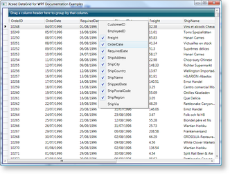
Figure 1: Column chooser
The column-chooser context menu is represented by the ColumnChooserContextMenu class and exposes an ItemTemplate property can be changed to provide a new DataTemplate that will modify what is displayed in the menu and how. It also exposes a SortOrder property, which, like the ColumnChooserSortOrder property, allows the sort order to be changed.
| Property | Description |
|---|---|
| AscendingSortGlyph | Displayed when a column is sorted in an ascending direction. |
| AutoFilterGlyph | Displayed in a column-manager cell when a column is automatically filtered. |
| ClearSearchButtonGlyph | Displayed in the SearchControl's search TextBox when a search value is present. |
| CloseSearchButtonGlyph | Displayed in the SearchControl's close button. |
| CollapseGroupGlyph | Displayed when a group is expanded to allow it to be collapsed. |
| ConnectionStateCommittingGlyph | Displayed when data is being committed to a virtualized data collection. |
| ConnectionStateErrorGlyph | Displayed when an error has occurred with a virtualized data collection. |
| ConnectionStateLoadingGlyph | Displayed when data is being loaded from a virtualized data collection. |
| CurrentItemGlyph | Displayed when an item is current. |
| CollapseGroupGlyph | Displayed to allow a group to be collapsed. |
| DescendingSortGlyph | Displayed when a column is sorted in a descending direction. |
| EditingRowGlyph | Displayed when a row is being edited. |
| ExpandGroupGlyph | Displayed to allow a group to be expanded. |
| FilterRowGlyph | Displayed in a filter row's row selector. |
| InsertionRowGlyph | Displayed by the InsertionRow when a new data item is being created. |
| IsNextSearchEndedPresenterGlyph | Displayed in the SearchControl after a 'next search' request has ended. |
| IsPreviousSearchEndedPresenterGlyph | Displayed in the SearchControl after a 'previous search' request has ended. |
| IsSearchingPresenterGlyph | Displayed in the SearchControl when a search request is in progress. |
| NextSearchButtonGlyph | Displayed in the SearchControl's 'next search' button. |
| PreviousSearchButtonGlyph | Displayed in the SearchControl's 'previous search' button. |
| ValidationErrorGlyph | Displayed when a validation error occurs. |
| Property | Description | Class |
|---|---|---|
| BusyCursor | Gets or sets the image used for the mouse pointer when the datagrid is busy while a FilterCell or AutoFilterControl is being used. | UIViewBase |
| CannotDropDraggedElementCursor | Gets or sets the image used for the mouse pointer when an element cannot be dropped on its target. | UIViewBase |
| ColumnResizeWestEastCursor | Gets or sets the image used for the mouse pointer when a column is resized. | UIViewBase |
| RemovingGroupCursor | Gets or sets the image used for the mouse pointer when a GroupByItem is dragged out of a GroupByControl to ungroup it. | UIViewBase |
| CardResizeNorthSouthCursor | Gets or sets the image used for the mouse pointer when resizing vertically. | CardView |
| CardResizeWestEastCursor | Gets or sets the image used for the mouse pointer when resizing horizontally. | CardView |
| FixedColumnSplitterDraggedCursor | Gets or sets the image used for the mouse pointer when dragging the fixed column splitter. | TableView |
| RowSelectorResizeNorthSouthCursor | Gets or sets the image used for the mouse pointer when the RowSelector is used to resize a Row in TableView when the Orientation property of the TableViewItemsHost is Orientation.Vertical. | TableView |
| RowSelectorResizeWestEastCursor | Gets or sets the image used for the mouse pointer when the RowSelector is used to resize a Row in TableView when the Orientation property of the TableViewItemsHost is Orientation.Horizontal. | TableView |
All examples in this topic assume that the grid is bound to the Orders table of the Northwind database, unless stated otherwise.
Example 1: Setting a view and theme through attribute syntax
The following examples demonstrates how to use attribute syntax to apply a card-view layout, with the normal-color Aero theme, to a grid.
| XAML |
Copy Code |
|---|---|
<Grid xmlns:xcdg="http://schemas.xceed.com/wpf/xaml/datagrid"> <Grid.Resources> <xcdg:DataGridCollectionViewSource x:Key="cvs_orders" Source="{Binding Source={x:Static Application.Current}, Path=Orders}"/> </Grid.Resources> <xcdg:DataGridControl x:Name="OrdersGrid" ItemsSource="{Binding Source={StaticResource cvs_orders}}" View="CardView.Zune.NormalColor"/> </Grid> | |
| VB.NET |
Copy Code |
|---|---|
Dim view As New CardView() view.Theme = New ZuneNormalColorTheme() dataGridControl.View = view | |
| C# |
Copy Code |
|---|---|
CardView view = new CardView(); view.Theme = new ZuneNormalColorTheme(); dataGridControl.View = view; | |
Example 2: Setting a view and theme through property element syntax
The following examples demonstrates how to use property element syntax to apply a card-view layout, with the normal-color Aero theme, to a grid.
| XAML |
Copy Code |
|---|---|
<Grid xmlns:xcdg="http://schemas.xceed.com/wpf/xaml/datagrid"> <Grid.Resources> <xcdg:DataGridCollectionViewSource x:Key="cvs_orders" Source="{Binding Source={x:Static Application.Current}, Path=Orders}"/> </Grid.Resources> <xcdg:DataGridControl x:Name="OrdersGrid" ItemsSource="{Binding Source={StaticResource cvs_orders}}"> <xcdg:DataGridControl.View> <xcdg:CardView> <xcdg:CardView.Theme> <xcdg:ZuneNormalColorTheme/> </xcdg:CardView.Theme> </xcdg:CardView> </xcdg:DataGridControl.View> </xcdg:DataGridControl> </Grid> | |
| VB.NET |
Copy Code |
|---|---|
Dim view As New CardView() view.Theme = New ZuneNormalColorTheme() dataGridControl.View = view | |
| C# |
Copy Code |
|---|---|
CardView view = new CardView(); view.Theme = new ZuneNormalColorTheme(); dataGridControl.View = view; | |
Example 3: Displaying a scroll tip
The following example demonstrates how to display a scroll tip whose content and location have been modified.
The "flagConverter" resource represents a converter that is used to return the appropriate BitmapImage according to the value of the ShipCountry cell.
| XAML |
Copy Code |
|---|---|
<Grid> <Grid.Resources> <xcdg:DataGridCollectionViewSource x:Key="cvs_orders" Source="{Binding Source={x:Static Application.Current}, Path=Orders}" AutoCreateItemProperties="False"> <xcdg:DataGridCollectionViewSource.ItemProperties> <xcdg:DataGridItemProperty Name="ShipCountry"/> <xcdg:DataGridItemProperty Name="ShipCity"/> <xcdg:DataGridItemProperty Name="ShipAddress"/> <xcdg:DataGridItemProperty Name="ShipPostalCode"/> <xcdg:DataGridItemProperty Name="ShipName"/> <xcdg:DataGridItemProperty Name="OrderDate"/> <xcdg:DataGridItemProperty Name="ShippedDate"/> <xcdg:DataGridItemProperty Name="Freight"/> </xcdg:DataGridCollectionViewSource.ItemProperties> </xcdg:DataGridCollectionViewSource> <local:FlagPathConverter x:Key="flagConverter"/> <Style TargetType="{x:Type xcdg:ScrollTip}"> <Setter Property="HorizontalAlignment" Value="Center"/> <Setter Property="VerticalAlignment" Value="Center"/> <Setter Property="Width" Value="150"/> <Setter Property="Height" Value="125"/> </Style> </Grid.Resources> <xcdg:DataGridControl x:Name="OrdersGrid" ItemsSource="{Binding Source={StaticResource cvs_orders}}"> <xcdg:DataGridControl.Columns> <xcdg:Column FieldName="ShipCountry" IsMainColumn="True"> <xcdg:Column.CellContentTemplate> <DataTemplate> <Image Source="{Binding Converter={StaticResource flagConverter}}" StretchDirection="DownOnly"/> </DataTemplate> </xcdg:Column.CellContentTemplate> </xcdg:Column> </xcdg:DataGridControl.Columns> <xcdg:DataGridControl.View> <xcdg:TableView ShowScrollTip="True"> <xcdg:TableView.ScrollTipContentTemplate> <DataTemplate> <Grid> <Image Source="{Binding Path=[ShipCountry], Converter={StaticResource flagConverter}}"/> <TextBlock Text="{Binding Path=[ShipCountry]}" FontSize="14" FontWeight="UltraBold" HorizontalAlignment="Center" VerticalAlignment="Center"/> </Grid> </DataTemplate> </xcdg:TableView.ScrollTipContentTemplate> </xcdg:TableView> </xcdg:DataGridControl.View> </xcdg:DataGridControl> </Grid> | |
Example 4: Enabling the column chooser
The following example demonstrates how to enable the column chooser and change the sort order of the column names it displays.
| XAML |
Copy Code |
|---|---|
<Grid xmlns:xcdg="http://schemas.xceed.com/wpf/xaml/datagrid"> <Grid.Resources> <xcdg:DataGridCollectionViewSource x:Key="cvs_orders" Source="{Binding Source={x:Static Application.Current}, Path=Orders}" /> </Grid.Resources> <xcdg:DataGridControl x:Name="OrdersGrid" ItemsSource="{Binding Source={StaticResource cvs_orders}}"> <xcdg:DataGridControl.Columns> <xcdg:Column FieldName="OrderID" ShowInColumnChooser="False" /> <xcdg:Column FieldName="EmployeeID" Visible="False" /> <xcdg:Column FieldName="CustomerID" Visible="False" /> <xcdg:Column FieldName="ShipVia" Visible="False" /> </xcdg:DataGridControl.Columns> <xcdg:DataGridControl.View> <xcdg:TableView AllowColumnChooser="True" ColumnChooserSortOrder="TitleAscending" /> </xcdg:DataGridControl.View> </xcdg:DataGridControl> </Grid> | |
 Show All
 Hide All