Xceed DataGrid for WPF v7.3 Documentation
Table Views Overview
 |
Prerequisite Knowledge DataGrid Fundamentals: Views and Themes Overview |
The TableView class provides a traditional, non-animated table-view layout for the data items in a grid.
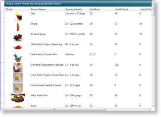
Figure 1: Table-view layout in Aero theme
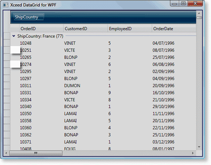 Figure 2: Group-level indicators |
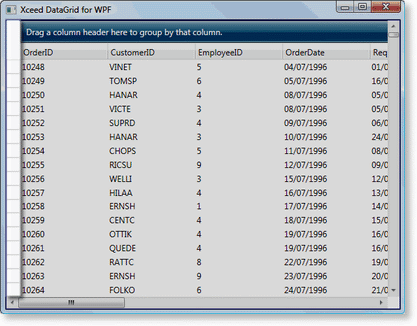 Figure 3: Row-selector pane |
Each theme provides an alternate row color, which can be activated by setting the TableView's IsAlternatingRowStyleEnabled property to true. By default, with the exception of the Glass theme, alternating row styles are not enabled.
Views define their associated grid's fixed header and fixed footer sections, which are non-scrollable regions usually located at the top and bottom of a grid, and its header and footer sections, which are scrollable regions usually located, respectively, beneath the fixed header and above the fixed footer sections (see Example 1).
By default, a grid will have a HierarhicalGroupByControl and ColumnManagerRow in its fixed header section. In XAML, the content of a header, footer, fixed header, and footer sections can be cleared by setting the UseDefaultHeadersFooters property of a view to false (see Example 2). If left to true, any items that are added to a header or footer section will be added after the default headers and footers.
Elements, such as group-by and group-header controls, can also be fixed to prevent them from scrolling with the grid content through the use of the CanScrollHorizontally attached property. The CanScrollHorizontally attached property has been set to false for the GroupByControl, HierarchicalGroupByControl, GroupHeaderControl, and RowSelectorPane in each table-view theme. If these elements are added manually to a fixed section of a grid in table-view layout, only the CanScrollHorizontally property of the group-by control must be explicitly set to false (see Example 6); the group-header control and row-selector pane, by default, already have their CanScrollHorizontally property set to false.
In addition to the built-in container recycling, which applies to all views, the TableView class provides column virtualization, meaning that columns and cells that are not visible in the viewport are not created until they are brought into the viewport or accessed. How column virtualization is managed, is determined by the value of the ColumnVirtualizationMode property.
If having a low memory consumption is important in your environment, Recycling mode is the one to use, because cells will be created only for columns that are in view, and will be reused (thus recycled) between columns as new columns are scrolled into view.
If horizontal scrolling performance is more important, choose the Virtualizing mode. In this mode, all cells are created in advance, and assigned to a specific column. Thus when a column is scrolled into view, the cost of preparing the cell is minimal, since it is already associated to the column. When scrolling is done, though cells are still associated to a column, they are "virtualized" (put in a non-available state) as if they had not been created, and thus the DataGrid performance is preserved in other scenarios (e.g. live updating, vertical scrolling, group expending/collapsing) because the UI is still virtualized as when recycling.
If memory and speed is not a concern, but cell availability is important, then use the None mode, as this will create all cells, and maintain them in a valid state at all times.
See UI Virtualization for a detailed explanation of virtualization.
All examples in this topic assume that the grid is bound to the Orders table of the Northwind database, unless stated otherwise.
Example 1: Adding an InsertionRow to the fixed headers
The following example demonstrates how to add an InsertionRow to the fixed header section of a grid.
| XAML |
Copy Code |
|---|---|
<Grid xmlns:xcdg="http://schemas.xceed.com/wpf/xaml/datagrid"> <Grid.Resources> <xcdg:DataGridCollectionViewSource x:Key="cvs_orders" Source="{Binding Source={x:Static Application.Current}, Path=Orders}"/> </Grid.Resources> <xcdg:DataGridControl x:Name="OrdersGrid" ItemsSource="{Binding Source={StaticResource cvs_orders}}"> <xcdg:DataGridControl.View> <xcdg:TableView> <xcdg:TableView.FixedHeaders> <DataTemplate> <xcdg:InsertionRow/> </DataTemplate> </xcdg:TableView.FixedHeaders> </xcdg:TableView> </xcdg:DataGridControl.View> </xcdg:DataGridControl> </Grid> | |
Example 2: Clearing a fixed header section
The following example demonstrates how to clear the content of all header and footer sections of a grid using its view's UseDefaultHeadersFooters property.
| XAML |
Copy Code |
|---|---|
<Grid xmlns:xcdg="http://schemas.xceed.com/wpf/xaml/datagrid"> <Grid.Resources> <xcdg:DataGridCollectionViewSource x:Key="cvs_orders" Source="{Binding Source={x:Static Application.Current}, Path=Orders}"/> </Grid.Resources> <xcdg:DataGridControl x:Name="OrdersGrid" ItemsSource="{Binding Source={StaticResource cvs_orders}}"> <xcdg:DataGridControl.View> <xcdg:CardView UseDefaultHeadersFooters="False"/> </xcdg:DataGridControl.View> </xcdg:DataGridControl> </Grid> | |
| VB.NET |
Copy Code |
|---|---|
Dim view As New CardView() view.UseDefaultHeadersFooters = False dataGridControl.View = view | |
| C# |
Copy Code |
|---|---|
CardView view = new CardView(); view.UseDefaultHeadersFooters = false; dataGridControl.View = view; | |
Example 3: Adding vertical and horizontal grid lines
The following example demonstrates how to add vertical and horizontal grid lines to a grid in table-view layout. A style for the ColumnManagerRow objects has been added to the resources to remove the horizontal grid line drawn above the column-manager row in the fixed headers.
| XAML |
Copy Code |
|---|---|
<Grid xmlns:xcdg="http://schemas.xceed.com/wpf/xaml/datagrid"> <Grid.Resources> <Style TargetType="{x:Type xcdg:ColumnManagerRow}"> <Setter Property="BorderThickness" Value="0"/> </Style> <xcdg:DataGridCollectionViewSource x:Key="cvs_orders" Source="{Binding Source={x:Static Application.Current}, Path=Orders}"/> </Grid.Resources> <xcdg:DataGridControl x:Name="OrdersGrid" ItemsSource="{Binding Source={StaticResource cvs_orders}}"> <xcdg:DataGridControl.View> <xcdg:TableView HorizontalGridLineThickness="1" VerticalGridLineThickness="1"> <xcdg:TableView.HorizontalGridLineBrush> <SolidColorBrush Color="Orange"/> </xcdg:TableView.HorizontalGridLineBrush> <xcdg:TableView.VerticalGridLineBrush> <SolidColorBrush Color="Orange"/> </xcdg:TableView.VerticalGridLineBrush> </xcdg:TableView> </xcdg:DataGridControl.View> </xcdg:DataGridControl> </Grid> | |
| VB.NET |
Copy Code |
|---|---|
Dim view As New TableView() view.HorizontalGridLineThickness = 1 view.VerticalGridLineThickness = 1 view.HorizontalGridLineBrush = Brushes.Orange view.VerticalGridLineBrush = Brushes.Orange dataGridControl.View = view | |
| C# |
Copy Code |
|---|---|
TableView view = new TableView();
view.HorizontalGridLineThickness = 1;
view.VerticalGridLineThickness = 1;

view.HorizontalGridLineBrush = Brushes.Orange;
view.VerticalGridLineBrush = Brushes.Orange;

dataGridControl.View = view; | |
Example 4: Hiding the group-level indicator pane
The following example demonstrates how to hide the group-level indicator pane by creating a style which sets the Visibility property of GroupLevelIndicatorPane objects to Collapsed.
| XAML |
Copy Code |
|---|---|
<Grid xmlns:xcdg="http://schemas.xceed.com/wpf/xaml/datagrid"> <Grid.Resources> <Style TargetType="{x:Type xcdg:GroupLevelIndicatorPane}"> <Setter Property="Visibility" Value="Collapsed"/> </Style> <xcdg:DataGridCollectionViewSource x:Key="cvs_orders" Source="{Binding Source={x:Static Application.Current}, Path=Orders}"> <xcdg:DataGridCollectionViewSource.GroupDescriptions> <xcdg:DataGridGroupDescription PropertyName="ShipCountry"/> </xcdg:DataGridCollectionViewSource.GroupDescriptions> </xcdg:DataGridCollectionViewSource> </Grid.Resources> <xcdg:DataGridControl x:Name="OrdersGrid" ItemsSource="{Binding Source={StaticResource cvs_orders}}"/> </Grid> | |
Example 5: Hiding the row-selector pane
The following example demonstrates how to hide the row-selector pane.
| XAML |
Copy Code |
|---|---|
<Grid xmlns:xcdg="http://schemas.xceed.com/wpf/xaml/datagrid"> <Grid.Resources> <xcdg:DataGridCollectionViewSource x:Key="cvs_orders" Source="{Binding Source={x:Static Application.Current}, Path=Orders}"/> </Grid.Resources> <xcdg:DataGridControl x:Name="OrdersGrid" ItemsSource="{Binding Source={StaticResource cvs_orders}}"> <xcdg:DataGridControl.View> <xcdg:TableView ShowRowSelectorPane="False"/> </xcdg:DataGridControl.View> </xcdg:DataGridControl> </Grid> | |
| VB.NET |
Copy Code |
|---|---|
Dim view As New TableView() view.ShowRowSelectorPane = False dataGridControl.View = view | |
| C# |
Copy Code |
|---|---|
TableView view = new TableView(); view.ShowRowSelectorPane = false; dataGridControl.View = view; | |
Example 6: Allowing horizontal scrolling
The following example demonstrates how to prevent horizontal scrolling of the group-by control in the fixed header section.
| XAML |
Copy Code |
|---|---|
<Grid xmlns:xcdg="http://schemas.xceed.com/wpf/xaml/datagrid"> <Grid.Resources> <xcdg:DataGridCollectionViewSource x:Key="cvs_orders" Source="{Binding Source={x:Static Application.Current}, Path=Orders}"> <xcdg:DataGridCollectionViewSource.GroupDescriptions> <xcdg:DataGridGroupDescription PropertyName="ShipCountry"/> </xcdg:DataGridCollectionViewSource.GroupDescriptions> </xcdg:DataGridCollectionViewSource> </Grid.Resources> <xcdg:DataGridControl x:Name="OrdersGrid" ItemsSource="{Binding Source={StaticResource cvs_orders}}"> <xcdg:DataGridControl.View> <xcdg:TableView UseDefaultHeadersFooters="False"> <xcdg:TableView.FixedHeaders> <DataTemplate> <xcdg:GroupByControl xcdg:TableView.CanScrollHorizontally="True"/> </DataTemplate> <DataTemplate> <xcdg:ColumnManagerRow/> </DataTemplate> </xcdg:TableView.FixedHeaders> </xcdg:TableView> </xcdg:DataGridControl.View> </xcdg:DataGridControl> </Grid> | |
Example 7: Using routed view properties
The following example demonstrates how to set routed view properties on detail configurations to change the width of their detail indicators as well as to fix columns and remove the fixed-column splitter.
| XAML |
Copy Code |
|---|---|
<Grid xmlns:xcdg="http://schemas.xceed.com/wpf/xaml/datagrid" xmlns:local="clr-namespace:Xceed.Wpf.Documentation"> <Grid.Resources> <xcdg:DataGridCollectionViewSource x:Key="cvs_employees" Source="{Binding Source={x:Static Application.Current}, Path=Employees}" /> </Grid.Resources> <xcdg:DataGridControl x:Name="EmployeesGrid" ItemsSource="{Binding Source={StaticResource cvs_employees}}" AutoCreateDetailConfigurations="True"> <xcdg:DataGridControl.Columns> <xcdg:Column FieldName="Photo" Visible="False" /> </xcdg:DataGridControl.Columns> <xcdg:DataGridControl.DetailConfigurations> <xcdg:DetailConfiguration RelationName="Employee_Orders" Title="Employee Orders" xcdg:TableView.DetailIndicatorWidth="50" xcdg:TableView.FixedColumnCount="2"> <xcdg:DetailConfiguration.Columns> <xcdg:Column FieldName="EmployeeID" Visible="False" /> </xcdg:DetailConfiguration.Columns> <xcdg:DetailConfiguration.DetailConfigurations> <xcdg:DetailConfiguration RelationName="Order_OrderDetails" Title="Order Details" xcdg:TableView.ShowFixedColumnSplitter="False" xcdg:TableView.DetailIndicatorWidth="50"/> </xcdg:DetailConfiguration.DetailConfigurations> </xcdg:DetailConfiguration> </xcdg:DataGridControl.DetailConfigurations> </xcdg:DataGridControl> </Grid> | |
| VB.NET |
Copy Code |
|---|---|
dataGridControl.AutoCreateDetailConfigurations = True dataGridControl.Columns( "Photo" ).Visible = False Dim detailConfiguration As New DetailConfiguration() detailConfiguration.RelationName = "Employee_Orders" detailConfiguration.Title = "Employee Orders" detailConfiguration.Columns( "EmployeeID" ).Visible = False detailConfiguration.SetValue( TableView.DetailIndicatorWidthProperty, 50 ) detailConfiguration.SetValue( TableView.FixedColumnCountProperty, 2 ) Dim childDetailConfiguration As New DetailConfiguration() childDetailConfiguration.RelationName = "Order_OrderDetails" childDetailConfiguration.Title = "Order Details" childDetailConfiguration.SetValue( TableView.ShowFixedColumnSplitterProperty, false ) childDetailConfiguration.SetValue( TableView.DetailIndicatorWidthProperty, 50 ) detailConfiguration.DetailConfigurations.Add( childDetailConfiguration ) dataGridControl.DetailConfigurations.Add( detailConfiguration ) | |
| C# |
Copy Code |
|---|---|
dataGridControl.AutoCreateDetailConfigurations = true; dataGridControl.Columns[ "Photo" ].Visible = false; DetailConfiguration detailConfiguration = new DetailConfiguration(); detailConfiguration.RelationName = "Employee_Orders"; detailConfiguration.Title = "Employee Orders"; detailConfiguration.Columns[ "EmployeeID" ].Visible = false; detailConfiguration.SetValue( TableView.DetailIndicatorWidthProperty, 50 ); detailConfiguration.SetValue( TableView.FixedColumnCountProperty, 2 ); DetailConfiguration childDetailConfiguration = new DetailConfiguration(); childDetailConfiguration.RelationName = "Order_OrderDetails"; childDetailConfiguration.Title = "Order Details"; childDetailConfiguration.SetValue( TableView.ShowFixedColumnSplitterProperty, false ); childDetailConfiguration.SetValue( TableView.DetailIndicatorWidthProperty, 50 ); detailConfiguration.DetailConfigurations.Add( childDetailConfiguration ); dataGridControl.DetailConfigurations.Add( detailConfiguration ); | |
 Show All
 Hide All