Xceed DataGrid for WPF v7.3 Documentation
Surface Configurations
 |
Prerequisite Knowledge Views and Themes: Multi-surface Themes Overview |
Surface configurations, which can be applied to any surface exposed by a multi-surface view, support various regions in which data can be displayed. How and where the supported regions are displayed is determined by the multi-surfaces themes.
Table 1: Provided surface configurations
| Surface configuration | Theme | Description |
|---|---|---|
| CompleteSurfaceConfiguration | Elemental Themes Chameleon Theme |
Represents a surface configuration that consists of an image, title, and data region.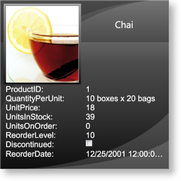 |
| ImageSurfaceConfiguration | Elemental Themes Chameleon Theme |
Represents a surface configuration that consists of only an image region. |
| TitleSurfaceConfiguration | Elemental Themes Chameleon Theme |
Represents a surface configuration that consists of only a title region. |
| DataSurfaceConfiguration | Elemental Themes Chameleon Theme |
Represents a surface configuration that consists of only a data region. |
| ImageAndTitleSurfaceConfiguration | Elemental Themes Chameleon Theme |
Represents a surface configuration that consists of an image and title region. |
| ImageAndDataSurfaceConfiguration | Elemental Themes Chameleon Theme |
Represents a surface configuration that consists of an image and data region. |
| TitleAndDataSurfaceConfiguration | Elemental Themes Chameleon Theme |
Represents a surface configuration that consists of a title and data region. |
A multi-surface theme provides the default SurfaceConfigurations that will be applied to a multi-surface view's surfaces. These default configurations can be overridden by adding surface configurations to a theme's SurfaceConfigurations collection and specifying the surfaces to which they will be applied using the Surfaces attached property defined on the multi-surface view (see Examples 1 and 3).
If a surface configuration is added to the SurfaceConfigurations collection but does not specify the surfaces to which it should be applied, it will be ignored. If more than one configuration specifies the same surface, the last one on which the Surfaces attached property was set will be used.
Each base surface configuration (see Table 1) supports various regions (title, image, and data) that display information from the fields in a data item and that can be configured through their corresponding region-configuration properties. The "complete" surface configuration displays all 3 three regions (see Figure 1), while the title, image, and data surface configurations display only their respective regions. The other surface configurations display combinations of these regions.
The 7 base surface configurations expose these region configurations through the DataRegionConfiguration, TitleRegionConfiguration, and ImageRegionConfiguration properties, when applicable (i.e., when a surface configuration supports the region).
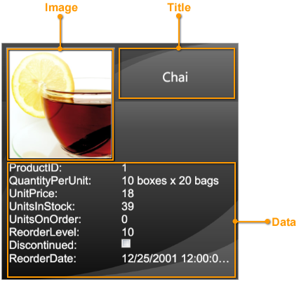
Figure 1: Complete surface configuration
By default, if a region configuration does not explicitly state the names of the fields to display or does not provide a new template for its corresponding region presenter, an attempt will be made to automatically extract the fields that will be displayed in each region. If an image field exists in the data source, it will automatically be displayed in the image region. In the case where more than one image is available, the first one that is found will be used. If no image is found and a surface configuration with an image region is used, a blank "place-holder" will be displayed in the image region. Furthermore, the title region will automatically display the value of the main column, and the data region will display the remaining fields.
When explicitly providing a region configuration, the names of the fields that will be displayed in the region must be specified through the FieldNames property as a case-sensitive comma-separated string. The ShowCellTitle attached property indicates whether the title of the parent column is displayed (e.g., "UnitsInStock:" in Figure 1) while the ImageStretchDirection and ImageStretch properties can be modified to determine how images in the region are scaled and stretched, respectively. By default, title and image regions are read-only. To allow them to be edited, the region configuration's ReadOnly property must be set to false.
In every surface configuration, a region (usually the data region) is identified as being the "default" region in which information from the fields that have not been explicitly assigned to another region is displayed. Setting a surface configuration's AutoFillDefaultRegion property to false will prevent this behavior; however, unless field names are explicitly assigned to the default region, it will remain empty. If the AutoFillDefaultRegion property is set to true (default) and field names are assigned, the specified fields will appear first in the region followed by the ones that were omitted.
A new DataTemplate that changes the layout of the fields in a region can be provided through the region configuration's Template property (see Example 3). If the fields in the region are to be edited, then DataCells must be used in the template. If no editing is required, then any other element (e.g., TextBlock) can be used or the ReadOnly property set to true.
Through the DefaultDataRegionConfiguration, DefaultTitleRegionConfiguration, and DefaultImageRegionConfiguration properties, a multi-surface theme can define region configurations that will be applied to all regions in all surfaces for which a corresponding region configuration has not been explicitly defined (see Examples 2 and 3).
The position of the title region is determined by each multi-surface theme, some of which support more than one location (see Table 2 in Multi-surface Themes Overview). As such, multi-surface themes that support multiple title-region positions expose a TitleRegionPosition attached property that is specific to the theme and which can be set on any of the supported surface configurations (see Example 2 in Multi-surface Themes Overview). The TitleRegionPosition property can also be set directly on the theme to change the title-region position of all the supported surface configurations.
All examples in this topic assume that the grid is bound to the Employees table of the Northwind database, unless stated otherwise.
Example 1: Providing surface configurations
The following example demonstrates how to provide an image and title surface configuration that will be applied to the center surface and a title surface configuration that will be applied to the left and right side cards.
| XAML |
Copy Code |
|---|---|
<Grid xmlns:xcdg="http://schemas.xceed.com/wpf/xaml/datagrid"> <Grid.Resources> <xcdg:DataGridCollectionViewSource x:Key="cvs_employees" Source="{Binding Source={x:Static Application.Current}, Path=EmployeesTable}"/> </Grid.Resources> <xcdg:DataGridControl x:Name="EmployeesGrid" ItemsSource="{Binding Source={StaticResource cvs_employees}}"> <xcdg:DataGridControl.Columns> <xcdg:Column FieldName="LastName" IsMainColumn="True"/> </xcdg:DataGridControl.Columns> <xcdg:DataGridControl.View> <xcdg:CardflowView3D> <xcdg:CardflowView3D.Theme> <xcdg:ElementalBlackTheme> <xcdg:ElementalBlackTheme.SurfaceConfigurations> <!-- Because an attempt is made to automatically detect an image in the data item, there is no need to specify the name of the field that contains the image in the surface configuration's ImageRegionConfiguration. If a data item contains more than one image you can set the FieldNames property of the ImageRegionConfiguration to the name of the field that contains the desired image. --> <xcdg:ImageAndTitleSurfaceConfiguration xcdg:CardflowView3D.Surfaces="Center"/> <!-- By default, the value of the main column will be displayed in the title regions. --> <xcdg:TitleSurfaceConfiguration xcdg:CardflowView3D.Surfaces="Left, Right"/> </xcdg:ElementalBlackTheme.SurfaceConfigurations> </xcdg:ElementalBlackTheme> </xcdg:CardflowView3D.Theme> </xcdg:CardflowView3D> </xcdg:DataGridControl.View> </xcdg:DataGridControl> </Grid> | |
| VB.NET |
Copy Code |
|---|---|
dataGridControl.Columns( "LastName" ).IsMainColumn = True Dim view As New CardflowView3D() Dim theme As New ElementalBlackTheme() ' Because an attempt is made to automatically detect an image in the data ' item, there is no need to specify the name of the field that contains ' the image in the surface configuration's ImageRegionConfiguration. ' If a data item contains more than one image you can set the FieldNames ' property of the ImageRegionConfiguration to the name of the field that ' contains the desired image. Dim imageAndTitleSurfaceConfiguration As new ImageAndTitleSurfaceConfiguration() imageAndTitleSurfaceConfiguration.SetValue( CardflowView3D.SurfacesProperty, CardflowView3DSurfaces.Center ) ' By default, the value of the main column will be displayed in the title regions. Dim titleSurfaceConfiguration As New TitleSurfaceConfiguration() titleSurfaceConfiguration.SetValue( CardflowView3D.SurfacesProperty, CardflowView3DSurfaces.Left And CardflowView3DSurfaces.Right ) theme.SurfaceConfigurations.Add( imageAndTitleSurfaceConfiguration ) theme.SurfaceConfigurations.Add( titleSurfaceConfiguration ) view.Theme = theme dataGridControl.View = view | |
| C# |
Copy Code |
|---|---|
dataGridControl.Columns[ "LastName" ].IsMainColumn = true; CardflowView3D view = new CardflowView3D(); ElementalBlackTheme theme = new ElementalBlackTheme(); // Because an attempt is made to automatically detect an image in the data // item, there is no need to specify the name of the field that contains // the image in the surface configuration's ImageRegionConfiguration. // If a data item contains more than one image you can set the FieldNames // property of the ImageRegionConfiguration to the name of the field that // contains the desired image. ImageAndTitleSurfaceConfiguration imageAndTitleSurfaceConfiguration = new ImageAndTitleSurfaceConfiguration(); imageAndTitleSurfaceConfiguration.SetValue( CardflowView3D.SurfacesProperty, CardflowView3DSurfaces.Center ); // By default, the value of the main column will be displayed in the title regions. TitleSurfaceConfiguration titleSurfaceConfiguration = new TitleSurfaceConfiguration(); titleSurfaceConfiguration.SetValue( CardflowView3D.SurfacesProperty, CardflowView3DSurfaces.Left | CardflowView3DSurfaces.Right ); theme.SurfaceConfigurations.Add( imageAndTitleSurfaceConfiguration ); theme.SurfaceConfigurations.Add( titleSurfaceConfiguration ); view.Theme = theme; dataGridControl.View = view; | |
Example 2: Providing a default region configuration
The following example demonstrates how to provide a default title-region configuration that will be used by all surfaces that display a title.
| XAML |
Copy Code |
|---|---|
<Grid xmlns:xcdg="http://schemas.xceed.com/wpf/xaml/datagrid"> <Grid.Resources> <xcdg:DataGridCollectionViewSource x:Key="cvs_employees" Source="{Binding Source={x:Static Application.Current}, Path=EmployeesTable}"/> </Grid.Resources> <xcdg:DataGridControl x:Name="EmployeesGrid" ItemsSource="{Binding Source={StaticResource cvs_employees}}"> <xcdg:DataGridControl.View> <xcdg:CardflowView3D> <xcdg:CardflowView3D.Theme> <xcdg:ElementalBlackTheme> <!-- The DefaultTitleRegionConfiguration will be applied to all title regions in all surfaces for which a RegionConfiguration has not been explicitly provided. --> <xcdg:ElementalBlackTheme.DefaultTitleRegionConfiguration> <xcdg:RegionConfiguration FieldNames="TitleOfCourtesy, FirstName, LastName, Title" ReadOnly="True"> <xcdg:RegionConfiguration.Template> <DataTemplate> <Viewbox> <StackPanel> <StackPanel Orientation="Horizontal" HorizontalAlignment="Center"> <StackPanel.Resources> <Style TargetType="{x:Type xcdg:DataCell}"> <Setter Property="Margin" Value="0, 0, 3, 0"/> </Style> </StackPanel.Resources> <xcdg:DataCell FieldName="TitleOfCourtesy"/> <xcdg:DataCell FieldName="FirstName"/> <xcdg:DataCell FieldName="LastName"/> </StackPanel> <xcdg:DataCell FieldName="Title" TextElement.FontSize="10" HorizontalContentAlignment="Center"/> </StackPanel> </Viewbox> </DataTemplate> </xcdg:RegionConfiguration.Template> </xcdg:RegionConfiguration> </xcdg:ElementalBlackTheme.DefaultTitleRegionConfiguration> </xcdg:ElementalBlackTheme> </xcdg:CardflowView3D.Theme> </xcdg:CardflowView3D> </xcdg:DataGridControl.View> </xcdg:DataGridControl> </Grid> | |
Example 3: Defining region configurations
The following example demonstrates how to define default and explicit region configurations.
| XAML |
Copy Code |
|---|---|
<Grid xmlns:xcdg="http://schemas.xceed.com/wpf/xaml/datagrid"> <Grid.Resources> <xcdg:DataGridCollectionViewSource x:Key="cvs_employees" Source="{Binding Source={x:Static Application.Current}, Path=EmployeesTable}" AutoCreateItemProperties="False"> <xcdg:DataGridCollectionViewSource.ItemProperties> <!--Will be explicitly positioned in the default "Title" region.--> <xcdg:DataGridItemProperty Name="Title"/> <xcdg:DataGridItemProperty Name="FirstName"/> <xcdg:DataGridItemProperty Name="LastName"/> <xcdg:DataGridItemProperty Name="TitleOfCourtesy"/> <!--Will be automatically detected as containing an image and displayed in the "Image" region.--> <xcdg:DataGridItemProperty Name="Photo"/> <!--Will appear in the "Data" region. There is no need to explicitly position them as, by default, the "Data" region displays information from the fields that have not been explicitly assigned to another region.--> <xcdg:DataGridItemProperty Name="EmployeeID" Title="Employee Identification #"/> <xcdg:DataGridItemProperty Name="Address"/> <xcdg:DataGridItemProperty Name="City"/> <xcdg:DataGridItemProperty Name="Country"/> <xcdg:DataGridItemProperty Name="PostalCode" Title="Postal Code"/> <xcdg:DataGridItemProperty Name="HomePhone" Title="Home Phone Number"/> <xcdg:DataGridItemProperty Name="BirthDate" Title="Date of Birth"/> </xcdg:DataGridCollectionViewSource.ItemProperties> </xcdg:DataGridCollectionViewSource> </Grid.Resources> <xcdg:DataGridControl x:Name="EmployeesGrid" ItemsSource="{Binding Source={StaticResource cvs_employees}}"> <xcdg:DataGridControl.View> <xcdg:CardflowView3D> <xcdg:CardflowView3D.Theme> <xcdg:ElementalBlackTheme> <!-- The DefaultTitleRegionConfiguration will be applied to all title regions in all surfaces for which a RegionConfiguration has not been explicitly provided. --> <xcdg:ElementalBlackTheme.DefaultTitleRegionConfiguration> <xcdg:RegionConfiguration FieldNames="TitleOfCourtesy, FirstName, LastName, Title" ReadOnly="True"> <xcdg:RegionConfiguration.Template> <DataTemplate> <Viewbox> <StackPanel> <StackPanel Orientation="Horizontal" HorizontalAlignment="Center"> <StackPanel.Resources> <Style TargetType="{x:Type xcdg:DataCell}"> <Setter Property="Margin" Value="0, 0, 3, 0"/> </Style> </StackPanel.Resources> <xcdg:DataCell FieldName="TitleOfCourtesy"/> <xcdg:DataCell FieldName="FirstName"/> <xcdg:DataCell FieldName="LastName"/> </StackPanel> <xcdg:DataCell FieldName="Title" TextElement.FontSize="10" HorizontalContentAlignment="Center"/> </StackPanel> </Viewbox> </DataTemplate> </xcdg:RegionConfiguration.Template> </xcdg:RegionConfiguration> </xcdg:ElementalBlackTheme.DefaultTitleRegionConfiguration> <xcdg:ElementalBlackTheme.SurfaceConfigurations> <!-- Because an attempt is made to automatically detect an image in the data item, there is no need to specify the name of the field that contains the image in the surface configuration's ImageRegionConfiguration. If a data item contains more than one image you can set the FieldNames property of the ImageRegionConfiguration to the name of the field that contains the desired image. --> <xcdg:ImageAndTitleSurfaceConfiguration xcdg:CardflowView3D.Surfaces="Center"/> <!-- Explicitly define a new template for the TitleRegionConfiguration since we want to use one that is different from the one provided in the DefaultTitleRegionConfiguration. In this situation, the names of the fields to display in the title region must be provided. --> <xcdg:TitleSurfaceConfiguration xcdg:CardflowView3D.Surfaces="Left, Right"> <xcdg:TitleSurfaceConfiguration.TitleRegionConfiguration> <xcdg:RegionConfiguration FieldNames="FirstName, LastName" ReadOnly="True"> <xcdg:RegionConfiguration.Template> <DataTemplate> <!--In this example, a fixed font size is not ideal since we don't know the final size of a card and we want the font size of the Title to vary along with the card size; therefore, we will place everything in a Viewbox, which will handle everything.--> <Viewbox> <!-- Using a Viewbox will stretch each title according to its content resulting in titles that can be of various sizes. This result may not always be esthetically pleasing and can also produce perspective problems (optical illusions). Giving the root element of the Viewbox an arbitrary width will correct this undesirable behavior. This size of 100 was determined by trial and error using our data source and it may be appropriate to change it according to the data.--> <Grid Width="100"> <!--This grid is used to center the title when its desired width is less than 100.--> <Grid.ColumnDefinitions> <ColumnDefinition Width="*"/> <ColumnDefinition Width="Auto"/> <ColumnDefinition Width="*"/> </Grid.ColumnDefinitions> <StackPanel Orientation="Horizontal" Grid.Column="1"> <xcdg:DataCell FieldName="FirstName" Margin="0, 0, 3, 0"/> <xcdg:DataCell FieldName="LastName"/> </StackPanel> </Grid> </Viewbox> </DataTemplate> </xcdg:RegionConfiguration.Template> </xcdg:RegionConfiguration> </xcdg:TitleSurfaceConfiguration.TitleRegionConfiguration> </xcdg:TitleSurfaceConfiguration> <!-- In this surface configuration there is no need to specify the field names to use since: - the image field is automatically detected and used in the image region - the fields used in the title region are specified in the DefaultTitleRegionConfiguration - the fields that have not been explicitly assigned to a specific region will automatically be placed in the default "Data" region. --> <xcdg:CompleteSurfaceConfiguration xcdg:CardflowView3D.Surfaces="Back"/> </xcdg:ElementalBlackTheme.SurfaceConfigurations> </xcdg:ElementalBlackTheme> </xcdg:CardflowView3D.Theme> </xcdg:CardflowView3D> </xcdg:DataGridControl.View> </xcdg:DataGridControl> </Grid> | |
Example 4: Coercing a surface configuration
The following example demonstrates how to apply a different surface configuration on the back surface of the center card using the CoercedSurfaceConfiguration attached property.
| VB.NET |
Copy Code |
|---|---|
Private m_fullSurfaceConfiguration As New ImageAndDataSurfaceConfiguration() Private Sub ApplyCoercedSurfaceConfiguration( ByVal sender As Object, ByVal e As RoutedEventArgs ) If Not Me.ProductsGrid.CurrentItem Is Nothing Then Dim card As Xceed.Wpf.DataGrid.DataRow = CType( Me.ProductsGrid.GetContainerFromItem( _ Me.ProductsGrid.CurrentItem ), Xceed.Wpf.DataGrid.DataRow ) If Not card Is Nothing Then card.SetValue( MultiSurfaceViewBase.CoercedSurfaceConfigurationProperty, m_fullSurfaceConfiguration ) End If End If End Sub | |
| C# |
Copy Code |
|---|---|
private ImageAndDataSurfaceConfiguration m_fullSurfaceConfiguration = new ImageAndDataSurfaceConfiguration(); private void ApplyCoercedSurfaceConfiguration( object sender, RoutedEventArgs e ) { if( this.ProductsGrid.CurrentItem != null ) { Xceed.Wpf.DataGrid.DataRow card = this.ProductsGrid.GetContainerFromItem( this.ProductsGrid.CurrentItem ) as Xceed.Wpf.DataGrid.DataRow; if( card != null ) { card.SetValue( MultiSurfaceViewBase.CoercedSurfaceConfigurationProperty, m_fullSurfaceConfiguration ); } } } | |
The following XAML demonstrates how to define the initial surface configurations that are applied to various surfaces.
| XAML |
Copy Code |
|---|---|
<Grid xmlns:xcdg="http://schemas.xceed.com/wpf/xaml/datagrid"> <Grid.RowDefinitions> <RowDefinition Height="Auto"/> <RowDefinition/> </Grid.RowDefinitions> <Grid.Resources> <xcdg:DataGridCollectionViewSource x:Key="cvs_products" Source="{Binding Source={x:Static Application.Current}, Path=ProductsTable}"/> </Grid.Resources> <Button Content="Coerce Surface Configuration" Click="ApplyCoercedSurfaceConfiguration" Grid.Row="0"/> <xcdg:DataGridControl x:Name="ProductsGrid" ItemsSource="{Binding Source={StaticResource cvs_products}}" Grid.Row="1"> <xcdg:DataGridControl.Columns> <xcdg:Column FieldName="ProductName" IsMainColumn="True"/> </xcdg:DataGridControl.Columns> <xcdg:DataGridControl.View> <xcdg:CardflowView3D CardHeightToViewportRatio="0.5"> <xcdg:CardflowView3D.Theme> <xcdg:ElementalBlackTheme> <xcdg:ElementalBlackTheme.SurfaceConfigurations> <xcdg:ImageSurfaceConfiguration xcdg:CardflowView3D.Surfaces="Left, Right"/> <xcdg:ImageAndTitleSurfaceConfiguration xcdg:CardflowView3D.Surfaces="Center"/> <xcdg:CompleteSurfaceConfiguration xcdg:CardflowView3D.Surfaces="Back" AutoFillDefaultRegion="False"> <xcdg:CompleteSurfaceConfiguration.DataRegionConfiguration> <xcdg:RegionConfiguration FieldNames="ProductID, UnitPrice, UnitsInStock"/> </xcdg:CompleteSurfaceConfiguration.DataRegionConfiguration> </xcdg:CompleteSurfaceConfiguration> </xcdg:ElementalBlackTheme.SurfaceConfigurations> </xcdg:ElementalBlackTheme> </xcdg:CardflowView3D.Theme> </xcdg:CardflowView3D> </xcdg:DataGridControl.View> </xcdg:DataGridControl> </Grid> | |
 Show All
 Hide All