
 |
Prerequisite Knowledge DataGrid Fundamentals: Views and Themes Overview Views and Themes: Multi-surface Themes Overview |
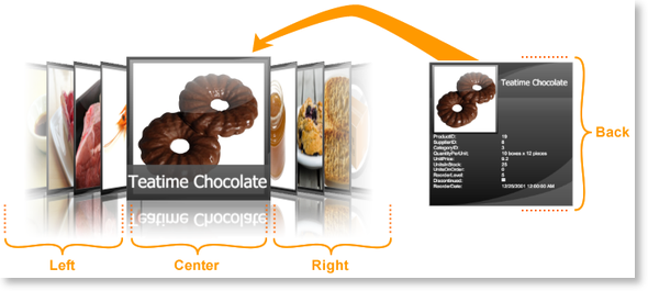
Multi-surface views are card views that expose multiple "surfaces", which represent the positions of cards in the view. Surfaces, such as those exposed by the Cardflow™ 3D view, can be exposed for the center card, the cards located to either side of the center card, or for any other desired surface (see Figure 1).

Figure 1: Surfaces exposed by the Cardflow™ 3D view
Surface configurations, which can be applied to any surface exposed by a multi-surface view, support various regions in which data can be displayed. How and where the supported regions are displayed is determined by the multi-surface themes, which provide the default surface configurations that will be applied to a multi-surface view's surfaces. These default configurations can be overridden by adding surface configurations to a theme's SurfaceConfigurations collection and specifying the surfaces to which they will be applied using the Surfaces attached property defined on the multi-surface view (see Examples 1 and 3 in Surface Configurations).
If a surface configuration is added to the SurfaceConfigurations collection but does not specify the surface(s) to which it should be applied, it will be ignored. If more than one configuration specifies the same surface, the last one on which the Surfaces attached property was set will be used.
In addition to specifying the surface configurations to apply to the surfaces exposed by a multi-surface view, surface configurations can also be applied to specific card surfaces, using the CoercedSurfaceConfiguration attached property (see Example 1). Setting the CoercedSurfaceConfiguration property to null (Nothing in Visual Basic), will result in an empty surface being displayed.
Through a multi-surface view's SurfaceConfigurationContext attached property, the properties exposed by a surface configuration and multi-surface theme (e.g., TitleRegionPosition and GradientLightColor) can be accessed in order to bind elements in the theme-defined ControlTemplates to their values or use them in triggers (see CardflowView3D.Elemental.Pink resource dictionary). The type of the coerced surface configuration can also be retrieved through the CoercedSurfaceConfigurationType property.
All examples in this topic assume that the grid is bound to the Products table of the Northwind database, unless stated otherwise.
Example 1: Coercing a surface configuration
The following example demonstrates how to apply a different surface configuration on the back surface of the center card using the CoercedSurfaceConfiguration attached property.
| VB.NET |
Copy Code |
|---|---|
Private m_fullSurfaceConfiguration As New ImageAndDataSurfaceConfiguration() Private Sub ApplyCoercedSurfaceConfiguration( ByVal sender As Object, ByVal e As RoutedEventArgs ) If Not Me.ProductsGrid.CurrentItem Is Nothing Then Dim card As Xceed.Wpf.DataGrid.DataRow = CType( Me.ProductsGrid.GetContainerFromItem( _ Me.ProductsGrid.CurrentItem ), Xceed.Wpf.DataGrid.DataRow ) If Not card Is Nothing Then card.SetValue( MultiSurfaceViewBase.CoercedSurfaceConfigurationProperty, m_fullSurfaceConfiguration ) End If End If End Sub | |
| C# |
Copy Code |
|---|---|
private ImageAndDataSurfaceConfiguration m_fullSurfaceConfiguration = new ImageAndDataSurfaceConfiguration(); private void ApplyCoercedSurfaceConfiguration( object sender, RoutedEventArgs e ) { if( this.ProductsGrid.CurrentItem != null ) { Xceed.Wpf.DataGrid.DataRow card = this.ProductsGrid.GetContainerFromItem( this.ProductsGrid.CurrentItem ) as Xceed.Wpf.DataGrid.DataRow; if( card != null ) { card.SetValue( MultiSurfaceViewBase.CoercedSurfaceConfigurationProperty, m_fullSurfaceConfiguration ); } } } | |
The following XAML demonstrates how to define the initial surface configurations that are applied to various surfaces.
| XAML |
Copy Code |
|---|---|
<Grid xmlns:xcdg="http://schemas.xceed.com/wpf/xaml/datagrid"> <Grid.RowDefinitions> <RowDefinition Height="Auto"/> <RowDefinition/> </Grid.RowDefinitions> <Grid.Resources> <xcdg:DataGridCollectionViewSource x:Key="cvs_products" Source="{Binding Source={x:Static Application.Current}, Path=ProductsTable}"/> </Grid.Resources> <Button Content="Coerce Surface Configuration" Click="ApplyCoercedSurfaceConfiguration" Grid.Row="0"/> <xcdg:DataGridControl x:Name="ProductsGrid" ItemsSource="{Binding Source={StaticResource cvs_products}}" Grid.Row="1"> <xcdg:DataGridControl.Columns> <xcdg:Column FieldName="ProductName" IsMainColumn="True"/> </xcdg:DataGridControl.Columns> <xcdg:DataGridControl.View> <xcdg:CardflowView3D CardHeightToViewportRatio="0.5"> <xcdg:CardflowView3D.Theme> <xcdg:ElementalBlackTheme> <xcdg:ElementalBlackTheme.SurfaceConfigurations> <xcdg:ImageSurfaceConfiguration xcdg:CardflowView3D.Surfaces="Left, Right"/> <xcdg:ImageAndTitleSurfaceConfiguration xcdg:CardflowView3D.Surfaces="Center"/> <xcdg:CompleteSurfaceConfiguration xcdg:CardflowView3D.Surfaces="Back" AutoFillDefaultRegion="False"> <xcdg:CompleteSurfaceConfiguration.DataRegionConfiguration> <xcdg:RegionConfiguration FieldNames="ProductID, UnitPrice, UnitsInStock"/> </xcdg:CompleteSurfaceConfiguration.DataRegionConfiguration> </xcdg:CompleteSurfaceConfiguration> </xcdg:ElementalBlackTheme.SurfaceConfigurations> </xcdg:ElementalBlackTheme> </xcdg:CardflowView3D.Theme> </xcdg:CardflowView3D> </xcdg:DataGridControl.View> </xcdg:DataGridControl> </Grid> | |