
 |
Prerequisite Knowledge DataGrid Fundamentals: Views and Themes Overview |
The DataGridControl class exposes the Print and ExportToXps methods, which allow a grid to be printed or exported as an XPS document. The class also exposes two methods to display a print preview.
The appearance of a grid when it is printed or exported (we will only refer to "printing" from now on) is determined by the view assigned to a grid's PrintView property and the theme assigned to the view's Theme property, which, by default, correspond to the PrintTableView view and GenericPrintTheme theme. When a grid is printed using the default view and theme, the resulting pages will not have headers or footers and only a column-manager row will be contained in a grid's fixed-header section regardless of the configuration of the runtime grid (see Figure 1).

Figure 1: Default print view
In addition to the properties exposed by the ViewBase class (see also Views and Themes Overview and Headers and Footers), the PrintTableView class, which derives from PrintViewBase, also exposes various printing-related properties. Like the TableView class, the PrintTableView class provides the same fixed-column related properties; however, these properties refer to the columns that will be repeated on each page rather than the columns that are fixed when a grid is scrolled.
The appearance of the fixed-column splitter can be defined for each row type through the PrintTableView.FixedColumnSplitterStyle attached property. Although the appearance of the fixed-column splitter can be defined for each row type, the width must be the same for all and can be set through the print table view's FixedColumnSplitterWidth property. The ShowFixedColumnSplitter property can be used to hide the fixed-column splitter even if some columns are repeated on each page.
The grid lines displayed when a grid is printed using the PrintTableView are determined by the VerticalGridLineBrush and HorizontalGridLineBrush properties, in conjunction with the VerticalGridLineThickness and HorizontalGridLineThickness properties.
Setting the CanSpanHorizontally attached property to true indicates whether an element, such as a group-by control, will span across all printed pages until the entire range of columns is printed, and then start again from the beginning of the column range. Setting it to false will cause the element to be repeated on every printed page (see Figure 2).

To style a DataGridControl's PrintView, it should be set to a custom PrintTableView resource, defining a PageStyle into which you insert implicit styles for the printed grid. Example 3, below, shows how to turn all datacells in the PrintView DeepPink.
The headers and footers of the printed pages can be defined by the PageHeaders and PageFooters properties exposed by the PrintViewBase class. The DataTemplates that are added to these collections represent the elements that will be displayed in the headers or footers of each printed page.
The current page number can be retrieved through the CurrentPageNumber attached property, which can be bound to in order to display the current page number in the headers or footers of a page (see Example 1).
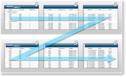
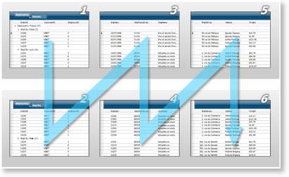
The order in which the pages are printed is determined by the value of the PagePrintOrder property. If set to Horizontal, the columns of the rows fitting on a given page will be printed on subsequent pages until all columns of those rows have been completely printed (see Figure 3). When set to Vertical, the same columns will be printed on subsequent pages to the end of the columns being printed (see Figure 4). So for example, given a grid with 10 columns, where only five columns can fit on a printed page, when PagePrintOrder is set to Horizontal, the first page will contain the first five columns, whereas the second page will contain the remaining five columns of those rows. In other words, all of the columns of the first group of rows being printed will be completed before moving on to the next group of rows. On the other hand, when PagePrintOrder is set to Vertical, the first page will contain the first five columns of the first group of rows, the second page will contain the first five columns of the second group of rows, and so on until the first five columns of the grid are printed in their entirety.
 Figure 3: Horizontal page print order |
 Figure 4: Vertical page print order |
The ShowPrintPreviewWindow and ShowPrintPreviewPopup methods provide print preview capabilities. ShowPrintPreviewPopup should be used when the application is being deployed as an XBAP, as XBAP applications cannot open new windows. The page view and page layout can be modified as described above for regular printing.
All examples in this topic assume that the grid is bound to the Employees table of the Northwind database, unless stated otherwise.
Example 1: Configuring a print view
The following example demonstrates how to use a PrintTableView and configure it to display a title in the page headers and the page number in the page footers. The elements added to these sections must be added as DataTemplates and will be repeated on each page.
The Print method will be called in the button's Click event, whose implementation is provided below.
| XAML |
Copy Code |
|---|---|
<Grid xmlns:xcdg="http://schemas.xceed.com/wpf/xaml/datagrid" xmlns:local="clr-namespace:Xceed.Wpf.Documentation"> <Grid.Resources> <xcdg:DataGridCollectionViewSource x:Key="cvs_employees" Source="{Binding Source={x:Static Application.Current}, Path=Employees}"/> </Grid.Resources> <DockPanel> <Button Content="Print Grid" Click="PrintGrid" DockPanel.Dock="Top"/> <xcdg:DataGridControl x:Name="EmployeesGrid" ItemsSource="{Binding Source={StaticResource cvs_employees}}"> <xcdg:DataGridControl.PrintView> <xcdg:PrintTableView> <xcdg:PrintTableView.PageHeaders> <DataTemplate> <TextBlock Text="Xceed WPF Documentation" HorizontalAlignment="Center" FontWeight="Bold" FontSize="20"/> </DataTemplate> <DataTemplate> <TextBlock Text="Printing Example" HorizontalAlignment="Center" FontSize="16"/> </DataTemplate> </xcdg:PrintTableView.PageHeaders> <xcdg:PrintTableView.PageFooters> <DataTemplate> <TextBlock Text="{xcdg:ViewBinding CurrentPageNumber}" HorizontalAlignment="Right"/> </DataTemplate> </xcdg:PrintTableView.PageFooters> </xcdg:PrintTableView> </xcdg:DataGridControl.PrintView> </xcdg:DataGridControl> </DockPanel> </Grid> | |
| VB.NET |
Copy Code |
|---|---|
Private Sub PrintGrid( ByVal sender As Object, ByVal e As RoutedEventArgs ) Me.EmployeeGrid.Print( "Employee_Grid", True ) End Sub | |
| C# |
Copy Code |
|---|---|
private void PrintGrid( object sender, RoutedEventArgs e ) { this.EmployeesGrid.Print( "Employee_Grid", true ); } | |
Example 2: Configuring a progress window
The following example demonstrates how to change the default text displayed in the progress window when the Print or ExportToXps methods are called. The implementation of the PrintGrid method is provided below.
| XAML |
Copy Code |
|---|---|
<Grid xmlns:xcdg="http://schemas.xceed.com/wpf/xaml/datagrid"> <Grid.Resources> <xcdg:DataGridCollectionViewSource x:Key="cvs_employees" Source="{Binding Source={x:Static Application.Current}, Path=Employees}"/> </Grid.Resources> <DockPanel> <Button Content="Print Employee Information" Click="PrintGrid" DockPanel.Dock="Top"/> <xcdg:DataGridControl x:Name="EmployeesGrid" ItemsSource="{Binding Source={StaticResource cvs_employees}}" DockPanel.Dock="Bottom"> <xcdg:DataGridControl.PrintView> <xcdg:PrintTableView> <xcdg:PrintTableView.ProgressWindowDescription> <StackPanel Orientation="Horizontal"> <TextBlock Text="Printing page "/> <TextBlock Text="{Binding CurrentPageNumber}"/> <TextBlock Text=" of employee information..."/> </StackPanel> </xcdg:PrintTableView.ProgressWindowDescription> </xcdg:PrintTableView> </xcdg:DataGridControl.PrintView> </xcdg:DataGridControl> </DockPanel> </Grid> | |
| VB.NET |
Copy Code |
|---|---|
Private Sub PrintGrid( ByVal sender As Object, ByVal e As RoutedEventArgs ) Me.EmployeesGrid.Print( "EmployeeInformation", True ) End Sub | |
| C# |
Copy Code |
|---|---|
private void PrintGrid( object sender, RoutedEventArgs e ) { this.EmployeesGrid.Print( "EmployeeInformation", true ); } | |
Example 3: Applying a style to a PrintView
The following shows how to create a custom PrintTableView resource, which will cause all data cells to be displayed DeepPink:
Then, when you declare your DataGridControl: