The PopupContainer can be added in a xaml container to define the location of the
Popup in the visual tree & set its properties through bindings.
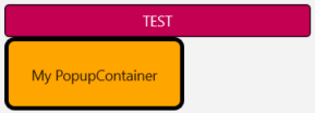
In the following example, a ToggleButton & a PopupContainer coexist in the visual tree. The PopupContainer is anchored to the ToggleButton, using the ToggleButton's bottom left side as the anchor point. The Popup created by the PopupContainer has an orange Background & contains a Label. This Popup opens when the ToggleButton becomes in its Checked state.
Visually, the following code would display this Control:
<xctk:ToggleButton x:Name="_toggleButton"
                   Content="TEST"
                   WidthRequest="300"/>
<xctk:PopupContainer Anchor="{Binding ., Source={x:Reference _toggleButton}}"
                     HorizontalOptions="Start"
                     VerticalOptions="End"
                     IsModal="False"
                     IsOpen="{Binding IsChecked, Source={x:Reference _toggleButton}}">
  <xctk:Border Background="Orange"
               BorderBrush="Black"
               BorderThickness="4"
               CornerRadius="8">
    <Label Text="My PopupContainer"
           Margin="20"/>
  </xctk:Border>
</xctk:PopupContainer>
Target Platforms: Windows 11, Windows 10, Windows 7, Windows Vista SP1 or later, Windows XP SP3, Windows Server 2008 (Server Core not supported), Windows Server 2008 R2 (Server Core supported with SP1 or later), Windows Server 2003 SP2