Xceed DataGrid for WPF v7.3 Documentation
Background Brushes Overview
The static DataGridControlBackgroundBrushes and CardBackgroundBrushes classes expose a variety of background brushes that can be applied to a grid or to cards.
The data-grid background brushes, as well as any other brush, can be used by assigning them to a grid's Background property (see Example 1).
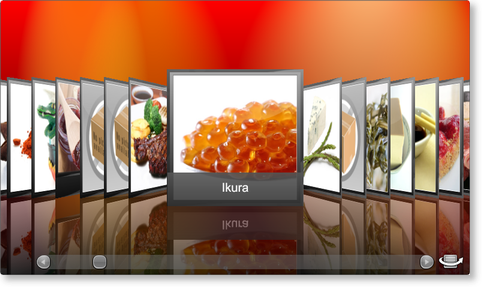
Figure 1: Cardflow 3D view with Aurora Red background
The card-specific brushes give the cards to which they are applied a textured look and feel. In 2D and 3D card-view layouts, "cards" represent the visual container of Row and Row-derived (e.g., DataRow) objects; therefore, in order to set their background, a style that targets DataRow (or any other Row type) and that sets its Background property to the desired brush must be provided (see Example 2).

Figure 2: Pebbles background textured brush
All examples in this topic assume that the grid is bound to the Products table of the Northwind database, unless stated otherwise.
Example 1: Applying a grid background brush
The following example demonstrates how to apply a one of the custom background brushes (provided by Xceed) to a grid's background.
| XAML |
Copy Code |
|---|---|
<Grid xmlns:xcdg="http://schemas.xceed.com/wpf/xaml/datagrid"> <Grid.Resources> <xcdg:DataGridCollectionViewSource x:Key="cvs_products" Source="{Binding Source={x:Static Application.Current}, Path=ProductsTable}"/> </Grid.Resources> <xcdg:DataGridControl x:Name="ProductsGrid" ItemsSource="{Binding Source={StaticResource cvs_products}}" Background="{x:Static xcdg:DataGridControlBackgroundBrushes.AuroraRed}"> <xcdg:DataGridControl.Columns> <xcdg:Column FieldName="ProductName" IsMainColumn="True"/> </xcdg:DataGridControl.Columns> <xcdg:DataGridControl.View> <!-- In Cardflow 3D view, if a theme is not explicitly specified, the Elemental Black theme will be used. --> <xcdg:CardflowView3D CardHeightToViewportRatio="0.5"/> </xcdg:DataGridControl.View> </xcdg:DataGridControl> </Grid> | |
| VB.NET |
Copy Code |
|---|---|
dataGridControl.Background = DataGridControlBackgroundBrushes.AuroraRed | |
| C# |
Copy Code |
|---|---|
dataGridControl.Background = DataGridControlBackgroundBrushes.AuroraRed; | |
Example 2: Applying a card background brush
The following example demonstrates how to apply one of the custom background brushes (provided by Xceed) cards (i.e., data rows) by creating an implicit style that targets DataRow and that sets the background property.
| XAML |
Copy Code |
|---|---|
<Grid xmlns:xcdg="http://schemas.xceed.com/wpf/xaml/datagrid"> <Grid.Resources> <xcdg:DataGridCollectionViewSource x:Key="cvs_products" Source="{Binding Source={x:Static Application.Current}, Path=ProductsTable}"/> <Style TargetType="{x:Type xcdg:DataRow}"> <Setter Property="Background" Value="{x:Static xcdg:CardBackgroundBrushes.Retro}"/> </Style> </Grid.Resources> <xcdg:DataGridControl x:Name="ProductsGrid" ItemsSource="{Binding Source={StaticResource cvs_products}}"> <xcdg:DataGridControl.Columns> <xcdg:Column FieldName="ProductName" IsMainColumn="True"/> </xcdg:DataGridControl.Columns> <xcdg:DataGridControl.View> <xcdg:CardflowView3D CardHeightToViewportRatio="0.5"> <xcdg:CardflowView3D.Theme> <xcdg:ChameleonTheme/> </xcdg:CardflowView3D.Theme> </xcdg:CardflowView3D> </xcdg:DataGridControl.View> </xcdg:DataGridControl> </Grid> | |
 Show All
 Hide All