Launch the Property Pages and set the SmartItems Properties
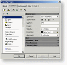
To launch the Property Pages, you first need to select the SmartUI, to right-click on the mouse, and select Properties in the Popup Menu. The Property Pages appear, with 5 different Tabs: click on the SmartItems Tab.
On the left side of the dialog are listed all the SmartItems, which are contained in this SmartUI. Each SmartItem added in this SmartUI will be displayed there (with image is relevant).
On the right side of the dialog is displayed a Property Toolbox, which displays all properties of the selected SmartItem, per category.
 button, select an Item category from the DropDown Menu, and a specific SmartItem from the SubMenu.
To remove a SmartItem or a SubItem, click on the
 button.
To clear the whole SmartItems Collection, click on the
 button.
Add a Tabulation
To implement the TabPos (make the Value begin at the TabPos position), you have to add a Tabulation.
To add this Tabulation, click on the  button.
Change a SmartItem's/SubItem's Position
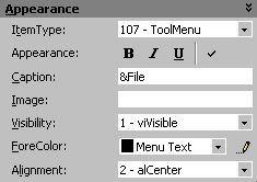
You can select the SmartItem Type, decide to display the caption in Bold, Italic, or Underline, and decide to Check the SmartItem when relevant (through the Checked Property).
You can edit the Caption, specify the Image location if you want to add an image, select the Visibility state (Hide, Visible, Visible only in extended mode) which allows you to implement the new Office 2000 look with ExtendMode, and choose the ForeColor of the caption.
You can also set the Alignment: the SmartItem can indeed be aligned to Left, to Right, or Centered. This property is useful for a vertical SmartUI.
Set The Hot Properties
To set the Hot properties, click on the Hot GroupToolbox.
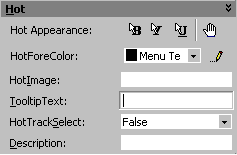
You can specify the SmartItem's Appearance when it is hot (HotBold, HotItalic, or HotUnderline), and decide whether or not you would like to transform the mouse pointer in a HandPointer form, when it moves hover the SmartItem.
You can also select the HotForeColor and HotImage you would like to be displayed, when the SmartItem is hot.
You can edit the ToolTipText for each SmartItem, and decide if you want to implement the HotTrackSelect feature. When this property is set to true, leaving the mouse hover the item a few seconds automatically selects the SmartItem (as if you has clicked on it).
And you can of course specify the Description which will be displayed in a PanelDescription.
Set the Behavior Properties
To set the Behavior properties, click on the Behavior GroupToolbox.
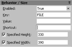
You can enable or disable the SmartItem (through the Enabled Property), specify a unique Key, set a Value depending on the SmartItem type, specify a Shortcut, and specify the Height and Width (same scale than the parent scale mode).
Set the Miscellaneous properties
To set the Miscellaneous properties, click on the Miscellaneous GroupToolbox.
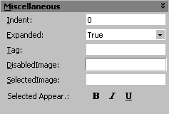
You can specify the Indent (indent 1, 2, 3, and so on, to create a Treeview effect, for example), and decide if the SmartItem should be Expanded or not (show/hide SubItems).
You can specify a Tag, choose a DisabledImage for the Disable state, choose a SelectedImage for the Selected state, and also specify, when needed, if you would like to implement a specific Caption Appearance when the SmartItem is selected (SelectedBold, SelectedItalic, SelectedUnderline).
Set the Custom Colors Properties
To set the Custom Colors properties, click on the CustomColors GroupToolbox.
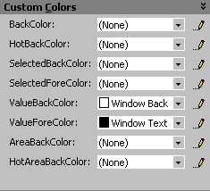
You can specify the BackColor, HotBackColor, SelectedBackColor. You can specify the SelectedForeColor.
You can also specify the ValueBackColor (this is the color of the Edit area), ans ValueForeColor.
And you can finally specify the color of the SmartItem's background through AreaBackColor, and HotAreaBackColor.
Remarks
The apply button is disabled, when the properties are automatically applied (WYSIWYG).
See Also
Global Tab, ListImages Tab, Color Tab ,Font Tab
