|
In order to use Xceed DataGrid for Silverlight in SharePoint 2010, SharePoint 2010 and Silverlight 4 must be installed. |
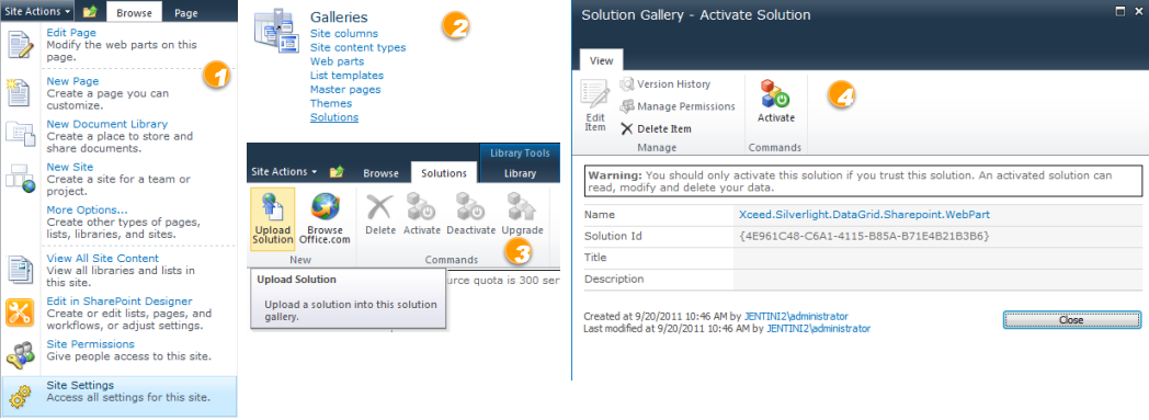
Xceed DataGrid for Silverlight provides a SharePoint web part that can be incorporated into any page and used to display data that is retrieved from a list. In order to add the web part to a page, the solution file for Xceed DataGrid for Silverlight (Xceed.Silverlight.DataGrid.SharePoint.WebPart.v#.#.wsp), which contains the web part, must first be added to the list of available SharePoint solutions in the Solution Gallery/Solutions section of SharePoint (1 and 2 in the image below). Once the solution has been uploaded (3) and the web part activated (4), it is now available for use.
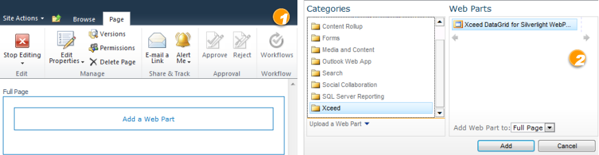
To add the Xceed DataGrid for Silverlight web part to a page, begin by creating a new, or editing an existing, web-part page and in the page, click on the Add a Web Part link (1) in the desired section, and select Xceed DataGrid for Silverlight WebPart from the list of available web parts (2).
Configuring the Web Part
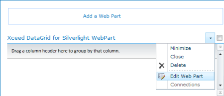
With the page in edit mode, select the Edit Web Part option from the drop-down menu to being configuring the Xceed DataGrid for Silverlight web part.
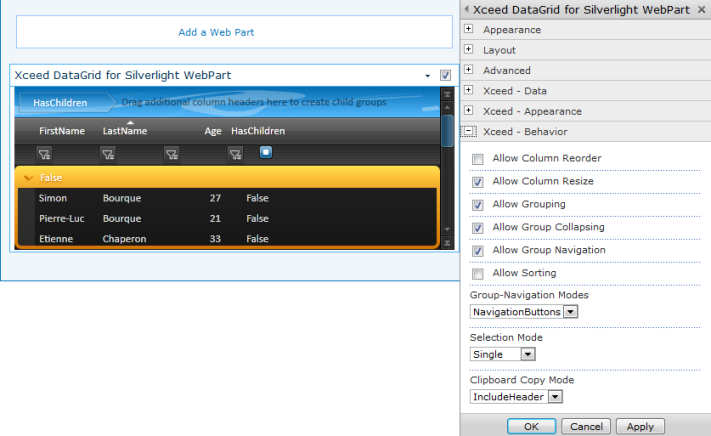
There are 3 sections in the web part's property grid through which the grid can be configured: Xceed - Data, which contains all the data-related settings, Xceed - Appearance, which contains all the apperance-related settings, and Xceed - Behavior, which contains all the behavior-related settings.
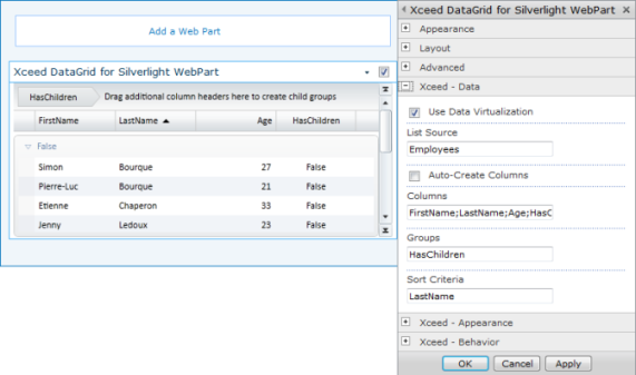
The first section, Xceed - Data, exposes the data-related settings (see Table 1), which include the List Source property, which defines the SharePoint list to which the grid will be bound and from which its data will be retrieved. By default, all columns that are defined in the list will be displayed in the grid. To limit the columns that are displayed, uncheck the Auto-Create Columns setting and define the names of the columns to display, each separated by a semicolon (';'), through the Columns setting. How the data items are grouped and sorted can be defined through the Groups and Sort Criteria settings, respectively.
Table 1: Xceed - Data Settings
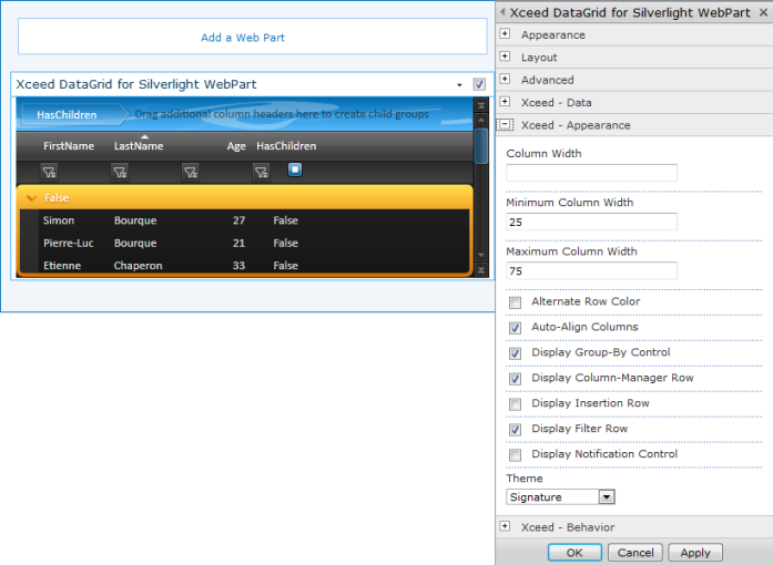
The Xceed - Appearance section exposes the appearance-related settings (see Table 2), which include various column-width settings, the possibility to specifying which headers are footers are to be displayed, the theme to be applied to the grid and its elements, as well as various other settings.
Table 2: Xceed - Appearance Settings
The last section, Xceed - Behavior, exposes the behavior-related settings (see Table 3), which include various settings that define the scope of the end user's interaction with the grid and also defines how group navigtion, selection, and clipboard copying behave.
Table 3: Xceed - Behavior Settings