Styles are a collection of properties and their associated values, which are applied to an element to override the default appearance provided by an element's default style. With the exception of columns (see Column class), all elements in a grid can be style by providing implicit or explicit styles.
Styles are usually, but not necessarily, defined in the resources of an element, which determines the scope of where that particular style can be used. For example, providing a style for a button in the resources of an application indicates that all buttons in the application can use the style. If a style is provided in a more limited scope (e.g., in a Window's resources) then only the elements defined in the Window can use the style.
The x:Key and TargetType properties of a style determine how a style is applied to the elements in the same scope. If only a key is provided, all elements that wish to use the style must explicitly reference it using a StaticResource markup extension. If only a target type is provided, all elements with the same type will automatically inherit the property values of the style. If a style provides both a key and a target type, the style will only be applied to the elements of the same target type that explicitly reference it by its key.
Theme Resource Dictionaries 
Xceed DataGrid for Silverlight provides a variety of theme resource dictionaries (see Table 1), which can be used to style (i.e., theme) the various elements found throughout a grid.
The styles in a theme resource dictionary can be applied implicitly or explicitly, depending on the value of the dictionary's StyleUsageMode property. If set to Implicit—or not set at all—all the theme's styles will be applied unless a style that overrides the theme's styles is provided. If set to Explicit, the styles in the resource dictionary can be applied selectively using their key (see Table 2).
<ResourceDictionary>
    <ResourceDictionary.MergedDictionaries>
        <sldg:SignatureThemeResourceDictionary StyleUsageMode="Implicit"/>
    </ResourceDictionary.MergedDictionaries>
</ResourceDictionary>
Table 1: Themes and syntaxes
Creating "BasedOn" Styles
Every theme resource dictionary contains styles that can be used as the basis of customized versions of the built-in styles to create customized versions of the built-in styles. These styles can be referenced as a static resource using their key (see Table 2), which follows the [Theme][Type]Style naming convention (e.g., SignatureThemeGroupHeaderStyle). Obviously, you also need to include the desired theme resource dictionary within an accessible scope.
Table 2: Explicit styles and keys


<ResourceDictionary>
   <ResourceDictionary.MergedDictionaries>
      <sldg:Excel2007BlackThemeResourceDictionary/>
      <sldg:SignatureThemeResourceDictionary StyleUsageMode="Explicit"/>
   </ResourceDictionary.MergedDictionaries>

   <Style TargetType="sldg:GroupHeaderControl"
           BasedOn="{StaticResource SignatureThemeGroupHeaderStyle}">
      <Setter Property="Background"
                Value="DeepPink" />
   </Style>
</ResourceDictionary>
Row and Cell Styles
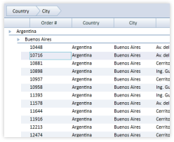
Through a grid's RowStyle property, an explicit style that targets the DataRow type can be provided. This style will be applied to all the data-item containers (i.e., DataRow objects) and will override any implicit DataRow styles.
 |
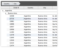
In most themes a transparent background color is defined in the DataRow styles, meaning that the background that you see is the grid's background and not the data-row's. The alternate data-row appearance is defined in the data-row style and is simply an opacity that is applied over the row. |
<Grid x:Name="LayoutRoot">
   <Grid.Resources>
      <ResourceDictionary>
         <ResourceDictionary.MergedDictionaries>
            <sldg:LiveExplorerThemeResourceDictionary/>
         </ResourceDictionary.MergedDictionaries>


         <Style x:Key="customDataRow"
                TargetType="sldg:DataRow"
                BasedOn="{StaticResource LiveExplorerThemeDataRowStyle}">
            <Setter Property="BorderBrush"
                    Value="Orange"/>
            <Setter Property="BorderThickness"
                    Value="1"/>
         </Style>
      </ResourceDictionary>
   </Grid.Resources>


   <sldg:DataGridControl x:Name="sldgDataGridControl"
                         RowStyle="{StaticResource customDataRow}"
                         ItemsSource="{Binding Path=Orders}"/>
</Grid>
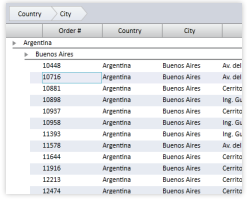
Although the background of rows can be changed through a style, it can also be changed through the grid's RowBackground and AlternatingRowBackground properties, which will change the background of even-numbered and odd-numbered rows, respectively. Some state groups (see Visual States topic) define alternate states, which are used when alternating row styles are applied. These alternate states can be disabled by setting the grid's AreAlternateStatesEnabled property to false. If the AreAlternateStatesEnabled property is set to false, the AlternatingRowBackground color will be ignored.
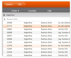
In addition to being able to provide implicit styles that target all cells in a grid, it is also possible to provide a style for the cells of one or more columns by setting the columns' CellStyle property.
<Grid x:Name="LayoutRoot">
   <Grid.Resources>
      <ResourceDictionary>
         <ResourceDictionary.MergedDictionaries>
            <sldg:SignatureThemeResourceDictionary/>
         </ResourceDictionary.MergedDictionaries>


         <Style x:Key="shipCountryDataCellStyle"
                TargetType="sldg:DataCell"
                BasedOn="{StaticResource SignatureThemeDataCellStyle}">
            <Setter Property="FontWeight"
                    Value="Bold"/>
         </Style>
      </ResourceDictionary>
   </Grid.Resources>


   <sldg:DataGridControl x:Name="sldgDataGridControl"
                         ItemsSource="{Binding Path=Orders}">
      <sldg:DataGridControl.Columns>
         <sldg:Column FieldName="ShipCountry"
                      Title="Country"
                      CellStyle="{StaticResource shipCountryDataCellStyle}"/>
      </sldg:DataGridControl.Columns>
   </sldg:DataGridControl>
</Grid>