Xceed Toolkit Plus for WPF v4.6 Documentation
Material controls
Welcome to Xceed Toolkit Plus for WPF v4.6 > DataGrid, ListBox, Chart, AvalonDock, and PropertyGrid > Material controls

The toolkit's material controls (see list below) were designed to follow the color palettes and animations defined by the Material Design Specifications.

Each control exposes a MaterialAccent property, which represents the material color palette that will be applied to the control. Each color palette defines complimentary background and foreground colors in addition to any other required brushes, such as the selection and border brushes. Setting the MaterialAccentBrush or MaterialForeground properties will override the values defined by the color palette assigned to the MaterialAccent property.
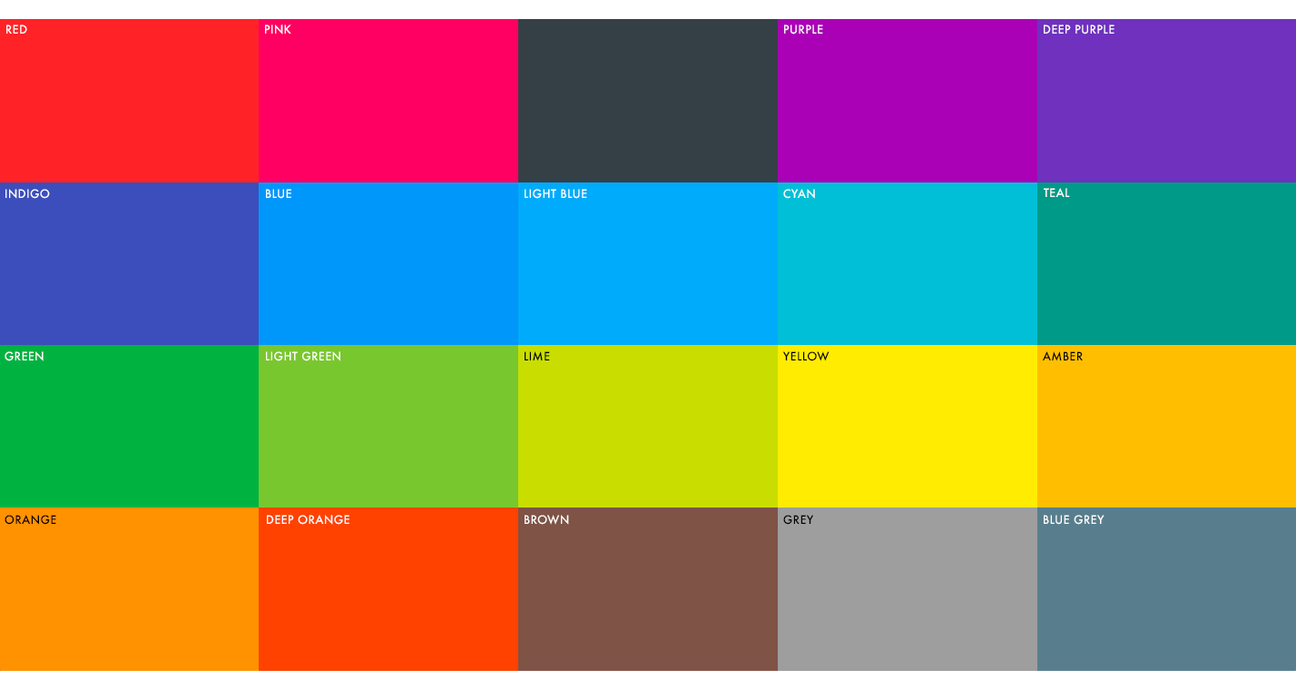
Click on the links below to get more information about each control and to see how each control appears when using different accent colors and settings.
<StackPanel x:Name="stack">
   <!-- Using one of the predefined material palettes -->
   <xctk:MaterialButton Content="DeepPurple material palette"
                        MaterialAccent="DeepPurple"
                        Width="150"
                        Height="25" 
                        Margin="5"/>
   <!-- Using a custom brush -->
   <xctk:MaterialButton Content="Custom colors"
                        MaterialAccentBrush="Aqua"
                        MaterialForeground="White"
                        Width="150"
                        Height="25"
                        Margin="5"/>
</StackPanel>

Material Design Color Palette