The image (artistic) frames supported by the background object can greatly increase the visual appearance of the control because they have an associated fill effect, border, shadow and shading effect combined with full control over the frame dimensions and style. All this makes this type of frame very flexible and visually attractive.
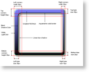
To better understand the different elements of the image frame lets take a look at the following picture showing the different image frame elements:
This image shows a rounded image frame with applied horizontal gradient filling, aquamarine border, linear blur shadow and modified settings for corner and tube size. Before we start to elaborate on the different properties of the image frame, let's first take a look at the most important property, which is of course the Type property defining the different image frame styles:
| Frame type | Description | Preview |
|---|---|---|
| None | No image frame is displayed. |  |
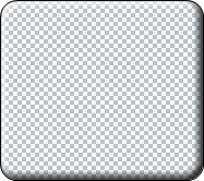
| Raised | Image frame with rounded corners that has no filling only a shading effect simulating a raised border. |
 |
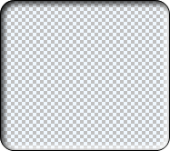
| Sunken | Image frame with rounded corners that has no filling only a shading effect simulating a sunken border. |
 |
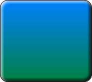
| Emboss | Image frame with rounded corners that completely obscures the background filling with a shading effect simulating a raised border. |
 |
| Embed | Image frame with rounded corners that completely obscures the background filling with a shading effect simulating a raised border. |
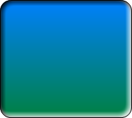 |
| Rounded | Image frame with rounded corners and filling with controllable corner and tube sizes. |
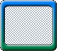 |
| RoundedTop | Image frame with top rounded corners and square bottom corners. |
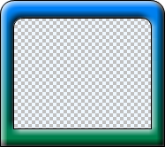 |
| RoundedBottom | Image frame with square top corners and rounded bottom corners. |
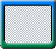 |
| RoundedOpenR | Image frame with rounded corners and no right tube. |
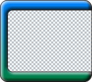 |
| RoundedOpenL | Image frame with rounded corners and no left tube. |
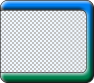 |
| RoundedOpenRL | Image frame with rounded corners and no left and right tubes. |
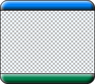 |
| Colonial | Currenty same as RoundedOpenRL |  |
| Rectangle | Image frame with square top and bottom corners. |
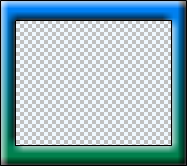 |
| RectangleInnerRounded | Image frame with square outer corners and rounded inner corners. |
 |
| RectangleOuterRounded | Image frame with rounded outer corners and square inner borders. |
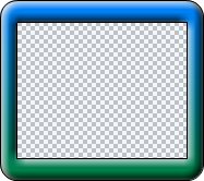 |
Now let's take a closer look at the rest of the properties of the ImageFrame object.
Fill Effect
The FillEffect returns a reference to a FillEffect object controlling the filling applied on the image frame. The following code applies a gradient fill effect on the frame:
| VB.NET | |
|---|---|
| |
| C# | |
|---|---|
| |
The default fill effect is white.
Border
The Border property returns a reference to a LineProperties object controlling the border (outline) of the image frame. The following code changes the border color and width:
| VB.NET | |
|---|---|
| |
| C# | |
|---|---|
| |
Shadow
The image frame also has an associated shadow, whose properties you can modify through the Shadow property, which returns a reference to a Shadow object. The following code applies a linear blur shadow with semi transparent black color:
| VB.NET | |
|---|---|
| |
| C# | |
|---|---|
| |
Shading effect
You’ve probably noticed on the images above that the image frame has a shading effect applied on the border edges. This effect is controllable via the LightColor, ShadowColor and LightEffectSize (specified in pixels) properties. The following code modifies the settings for these properties:
| VB.NET | |
|---|---|
| |
| C# | |
|---|---|
| |
Tube size
The image frame has four tubes: left, top, right and bottom. Their sizes are controlled via the LeftTubeSize, TopTubeSize, RightTubeSize and BottomTubeSize properties, respectively. Note that the tube size cannot exceed the size of the corner for the corresponding tube. For example, the LeftTubeSize cannot exceed the size specified by the LeftCornersWidth property. If it does, the control will automatically clamp it. All tube sizes are specified in pixels. The following example increases the left tube size:
| VB.NET | |
|---|---|
| |
| C# | |
|---|---|
| |
Note that certain frame styles will discard the settings for tube size. For example, the RoundedOpenL style discards the LeftTubeSize property.
Corner size
The size of the image frame's corners are controlled through the LeftCornersWidth, RightCornersWidth, TopCornersHeight and BottomCornersHeight properties. For example, the left top corner of the image border has dimensions [LeftCornersWidth, TopCornersHeight]. The dimensions of the corner work together with the InnerEdgePercent and OuterEdgePercent when round edges are created.
Round edge control
The InnerEdgePercent and the OuterEdgePercent properties control the rounding of the inner and outer edges of the image frame, respectively.
The OuterEdgePercent specifies the size of the arc as a percentage of the frame corner width or height, depending on which one is smaller.
The InnerEdgePercent specifies the size of the arc as a percentage of either the frame corner width minus the vertical tube width or the frame corner height minus the horizontal tube height, depending on which one is smaller.
Note that some frame styles discard the settings for edges, such as the Rectangle frame type, which discards both.
Background color
The background color property controls the color applied on the background of the frame. You may wish to change this property to a different color depending on the background of the form or webpage on which the component resides. For example, most websites use white as the page color. The following code changes the background color:
| VB.NET | |
|---|---|
imageBorder.BackgroundColor = Color.White | |
| C# | |
|---|---|
imageBorder.BackgroundColor = Color.White; | |
